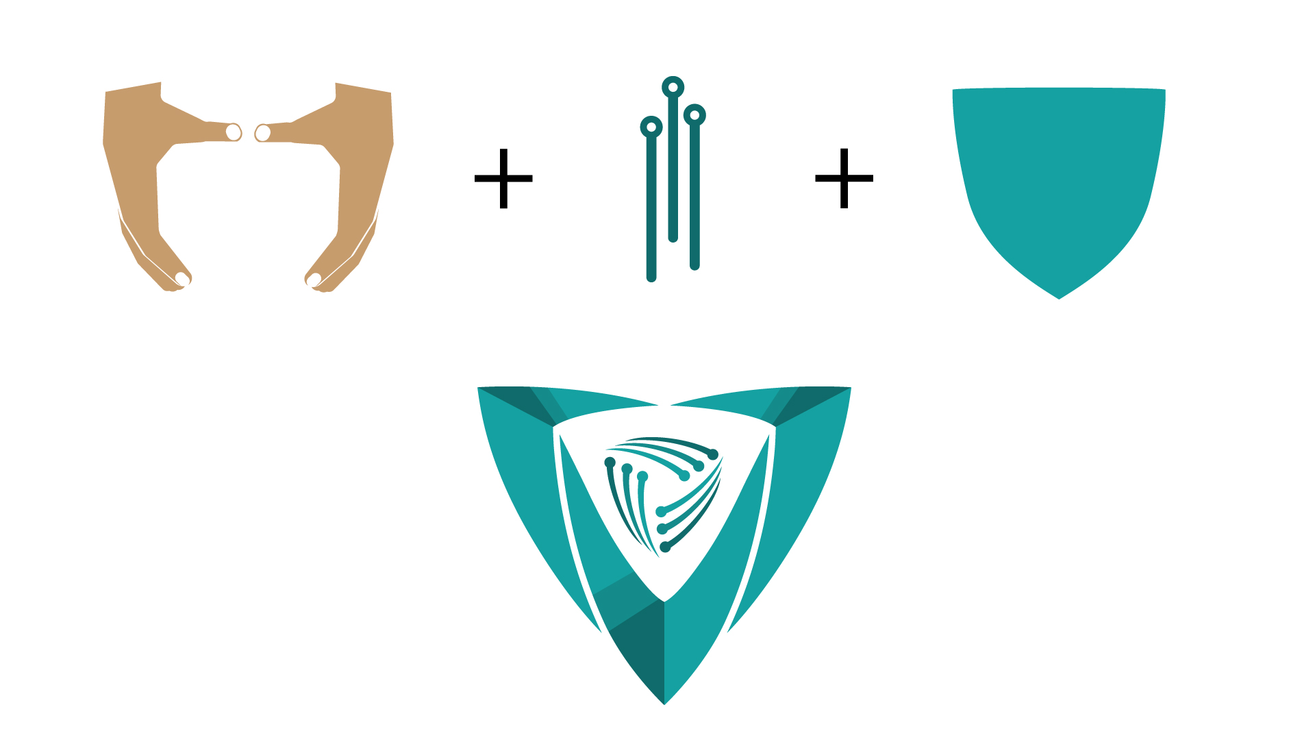
The CyberSecurity Summit organisation approached me with a distinctive mission – to create a logo that encapsulates their dedication to uniting cybersecurity professionals in Southeast Europe. The goal was not just to design an emblem but to visually communicate their commitment to collaboration, knowledge sharing, and innovation in the realm of cybersecurity.
Step 1: Understanding the Brief
Before delving into the design process, it’s crucial to grasp the client’s requirements, goals, and preferences. The Cyber Security Summit’s organising committee provided a detailed brief outlining their vision for the event and the desired outcomes. Key aspects of the client brief included:
1. Event Objectives: Understanding the primary objectives of the Cyber Security Summit, such as promoting cybersecurity awareness, fostering industry collaboration, and showcasing technological advancements.
2. Target Audience: Identifying the target audience demographics, including cybersecurity professionals, government officials, technology experts, and academia from Southeast Europe and neighbouring regions.
3. Theme and Tone: Determining the theme and tone of the event, which influenced the overall design direction of the summit logo. The theme focused on unity, collaboration, and technological advancement in cybersecurity.
4. Key Messages: Highlighting key messages and values associated with the summit, such as security, innovation, collaboration, and a safer digital future.
By thoroughly understanding the client brief, I am able to map out the Cyber Security Summit’s core identity and values, guiding the subsequent research and creative phases of logo development.
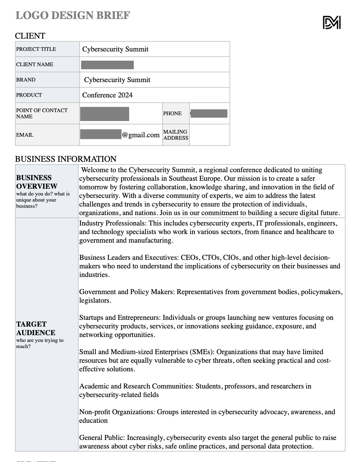
Client Brief:
Brand identity
Cybersecurity Summit, a regional conference dedicated to uniting cybersecurity professionals in Southeast Europe. Our mission is to create a safer tomorrow by fostering collaboration, knowledge sharing, and innovation in the field of cybersecurity. With a diverse community of experts, we aim to address the latest challenges and trends in cybersecurity to ensure the protection of individuals, organisations, and nations. Join us in our commitment to building a secure digital future.
Target Audience
Industry Professionals: This includes cybersecurity experts, IT professionals, engineers, and technology specialists who work in various sectors, from finance and healthcare to government and manufacturing.
Business Leaders and Executives: CEOs, CTOs, CIOs, and other high-level decision-makers who need to understand the implications of cybersecurity on their businesses and industries.
Government and Policy Makers: Representatives from government bodies, policymakers, legislators.
Startups and Entrepreneurs: Individuals or groups launching new ventures focusing on cybersecurity products, services, or innovations seeking guidance, exposure, and networking opportunities.
Small and Medium-sized Enterprises (SMEs): Organisations that may have limited resources but are equally vulnerable to cyber threats, often seeking practical and cost-effective solutions.
Academic and Research Communities: Students, professors, and researchers in cybersecurity-related fields.
Non-profit Organisations: Groups interested in cybersecurity advocacy, awareness, and education.
General Public: Increasingly, cybersecurity events also target the general public to raise awareness about cyber risks, safe online practices, and personal data protection.
Desired Style/Imagery: All variances of blue/green/white. Clean lines, simplicity.
Visuals: ‘Shield with diodes’
Key message: ‘United for a safer tomorrow.’
Step 2: Research
The research phase played a pivotal role in shaping the visual identity of the Cyber Security Summit. It involved thorough exploration and analysis of several key aspects:
1. Cybersecurity Trends: Researching current trends and developments in the cybersecurity industry, including emerging technologies, threat landscapes, and best practices. This helped in understanding the dynamic nature of cybersecurity and incorporating relevant elements into the logo design.
2. Regional Context: Considering the unique characteristics of Southeast Europe’s technological landscape, cybersecurity challenges, and the region’s contributions to the global cybersecurity ecosystem. This regional context influenced design choices and symbolism in the logo.
3. Audience Preferences: Studying the preferences and expectations of the target audience, particularly cybersecurity professionals and technology enthusiasts, regarding visual identity elements such as colour schemes, symbols, and messaging.
4. Competitor Analysis: Analysing existing visual identities of similar conferences, cybersecurity events, and industry-leading organisations to identify trends, differentiate the Cyber Security Summit, and ensure a distinct and impactful logo design.
5. Symbolism and Design Elements: Exploring symbolism associated with cybersecurity, technology, and digital security, such as shields, locks, circuits, and connectivity symbols. This research guided the selection of appropriate design elements for the summit logo.
By conducting comprehensive research, I was able to gain crucial insights into the visual language that resonates with cybersecurity professionals, the unique characteristics of the region, and the symbolism and design elements relevant to the industry. This research phase laid the foundation for the creative direction and conceptualisation of the summit logo.
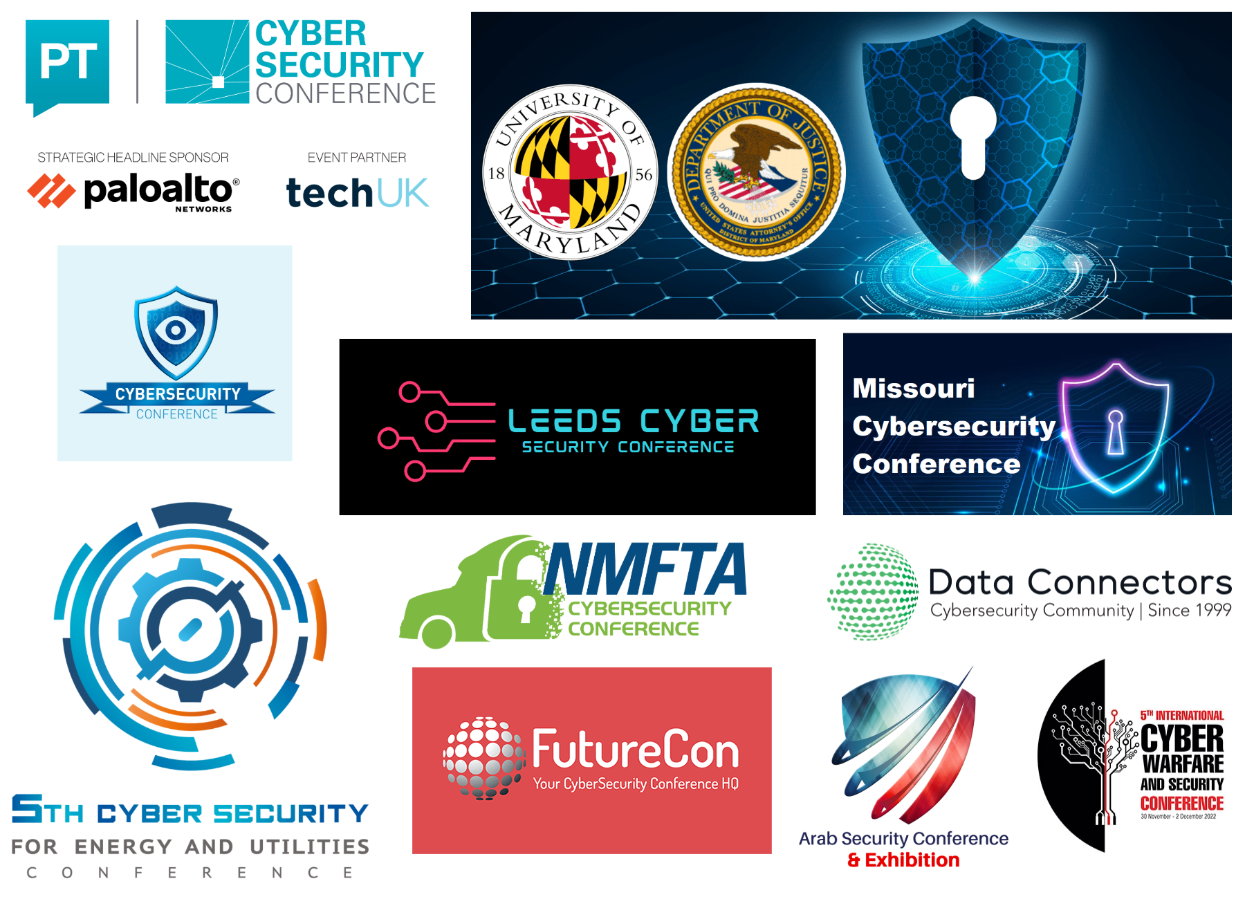
CyberSecurity Mood Board
Step 3: Creative Direction
Next, I’ll explore the Creative Direction phase, which involves translating the insights from research into design concepts for the CSS logo.
Based on the research findings and understanding of the client brief, the creative direction for the Cyber Security Summit logo focused on several key elements:
1. Symbolism: Incorporating symbols that represent security, technological connectivity, and collaboration. The use of a shield symbolises protection and defence against cyber threats, while diodes or circuits symbolise technology and connectivity.
2. Colour Palette: Selecting a colour palette that reflects the themes of security, innovation, and professionalism. Common colours associated with cybersecurity, such as blue for trust and stability, green for growth and security, and black for sophistication and protection, were considered for the logo design.
3. Typography: Choosing typography that balances readability with a modern, tech-savvy aesthetic. Sans-serif fonts with clean lines and a contemporary feel were explored to convey a sense of professionalism and technological advancement.
4. Tagline Integration: Incorporating the tagline “United for a safer tomorrow” to reinforce the summit’s mission of collaboration and collective effort towards a secure digital future. The tagline complements the symbolism in the logo and adds depth to its messaging.
5. Visual Impact: Ensuring the logo design is visually striking, memorable, and versatile across various applications, including digital and print media. Scalability and clarity were prioritised to maintain visibility and recognition across different platforms and sizes.
The creative direction phase involved brainstorming ideas, sketching initial concepts, and refining design elements to align with the client brief, research insights, and industry standards. This phase set the stage for the next steps in the logo development process, including brainstorming and conceptualisation.
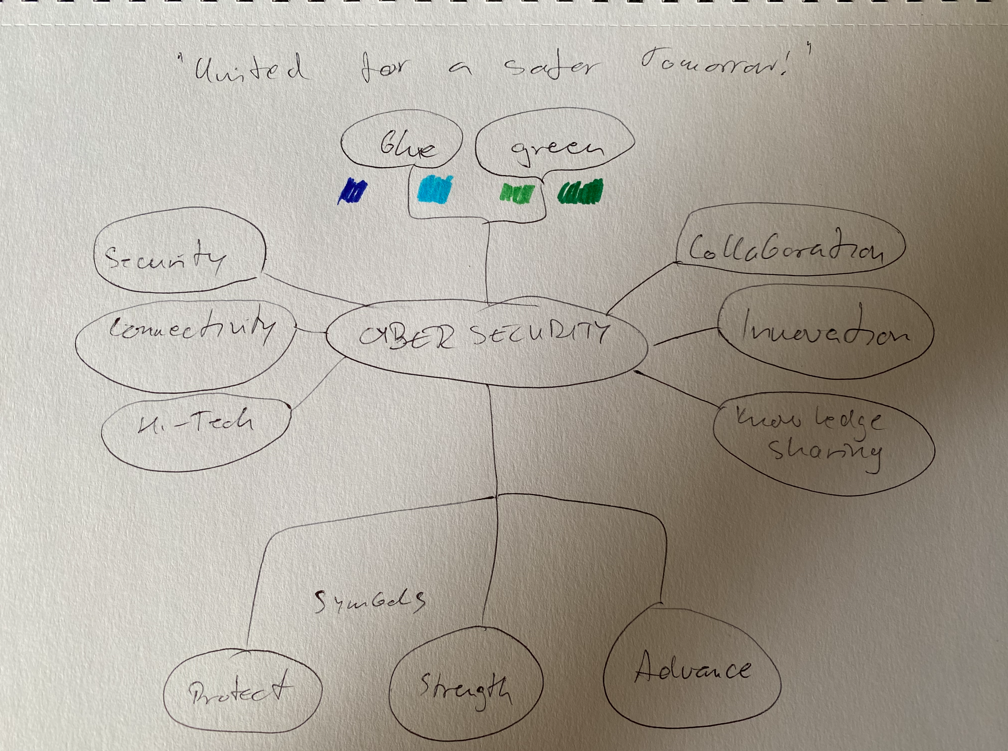
Mindmap for CSS visual identity
Step 4: Brainstorming and Conceptualisation
During the brainstorming and conceptualisation phase, I generated multiple ideas and concepts based on the creative direction established earlier. Key activities in this phase included:
1. Idea Generation: Generating a variety of design concepts that incorporate the chosen symbolism, colour palette, typography, and tagline. This phase involved sketching initial ideas, exploring different layouts, and experimenting with visual elements.
2. Concept Development: Refining selected concepts and developing them into more detailed design proposals. This process involved digital rendering of logo concepts, exploring variations in symbol placement, font styles, and colour combinations to achieve a cohesive and impactful design.
3. Feedback and Iteration: Seeking feedback from stakeholders, including the client’s team and industry experts, to gather input on the proposed logo concepts. Iterating based on feedback to refine and improve the designs, ensuring they align with the summit’s objectives and resonate with the target audience.
4. Mockups and Presentation: Creating mockups and presentations to visualise how the logo would appear in different contexts, such as digital screens, printed materials, and promotional merchandise. Mockups helped evaluate the logo’s versatility and suitability for various applications.
By exploring diverse ideas and iterating based on feedback, I was able to narrow down the options to select the most effective and impactful logo concept for the Cyber Security Summit.
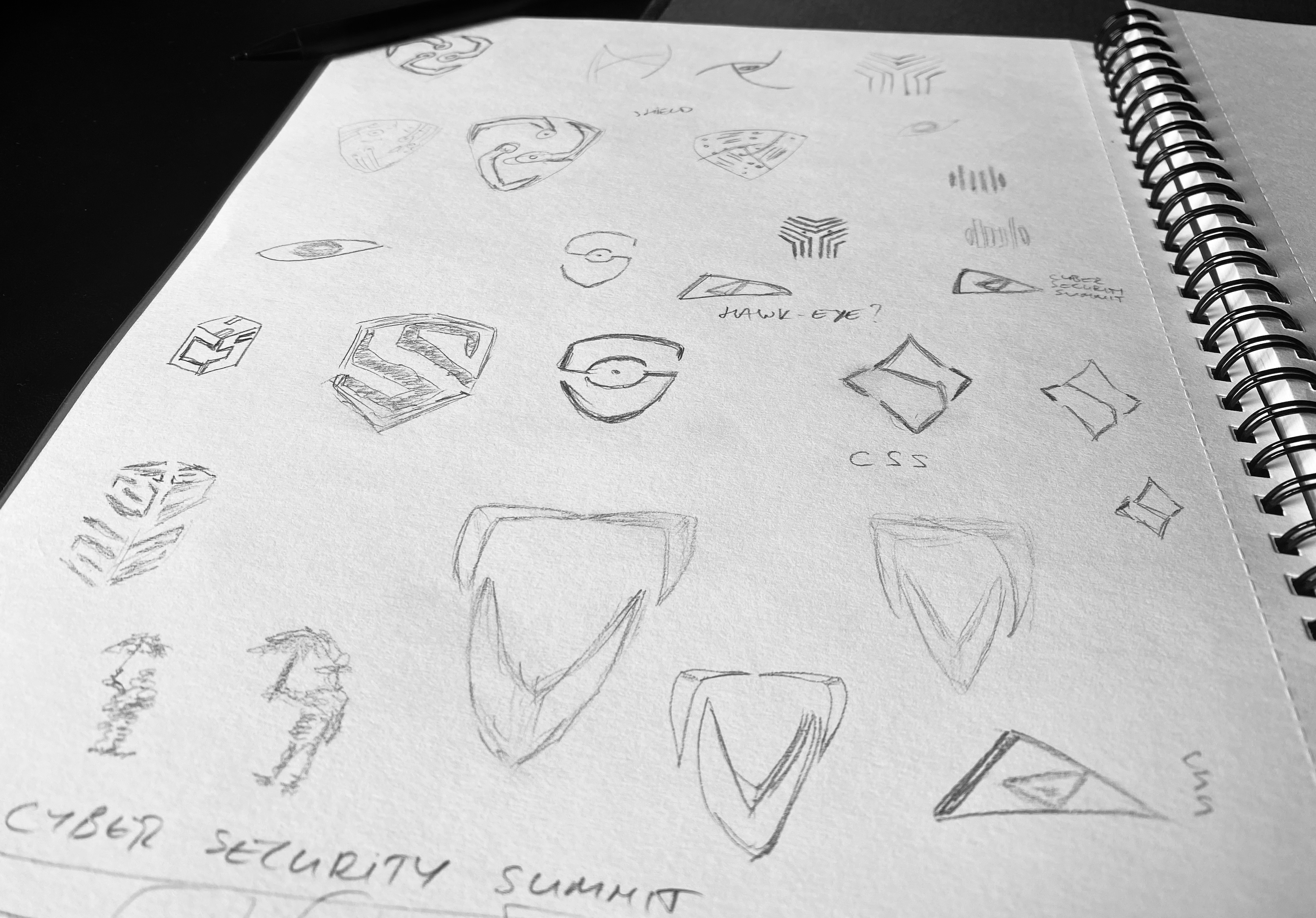
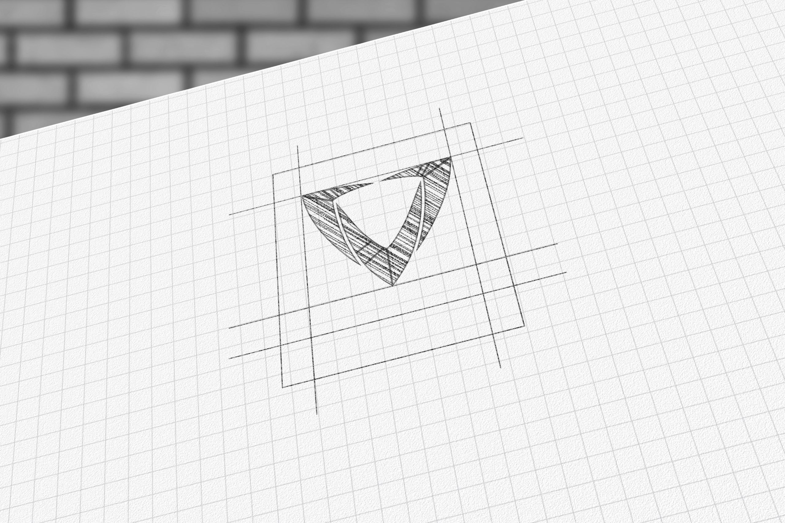
Logo concept sketches
Step 5: Designing the Symbol(s)
In this phase, the focus shifted towards refining and finalising the chosen logo concept that emerged from the brainstorming and conceptualisation stage. Key activities included:
1. Digital Rendering: Translating the selected logo concept into a digital format using graphic design software. This step allowed for precise alignment, scaling, and manipulation of design elements to achieve the desired look and feel.
2. Symbol Refinement: Fine-tuning the symbols and visual elements within the logo to ensure clarity, coherence, and symbolism alignment with cybersecurity themes. This involved adjusting shapes, line weights, and proportions for optimal visual impact.
3. Typography Integration: Incorporating the chosen typography for the summit’s name and tagline into the logo design. Ensuring consistency in font styles, sizes, and spacing to maintain readability and visual harmony.
4. Colour Application: Applying the selected colour palette to the logo design, considering factors such as contrast, readability, and colour psychology. Testing different colour combinations to find the most effective representation of security, innovation, and professionalism.
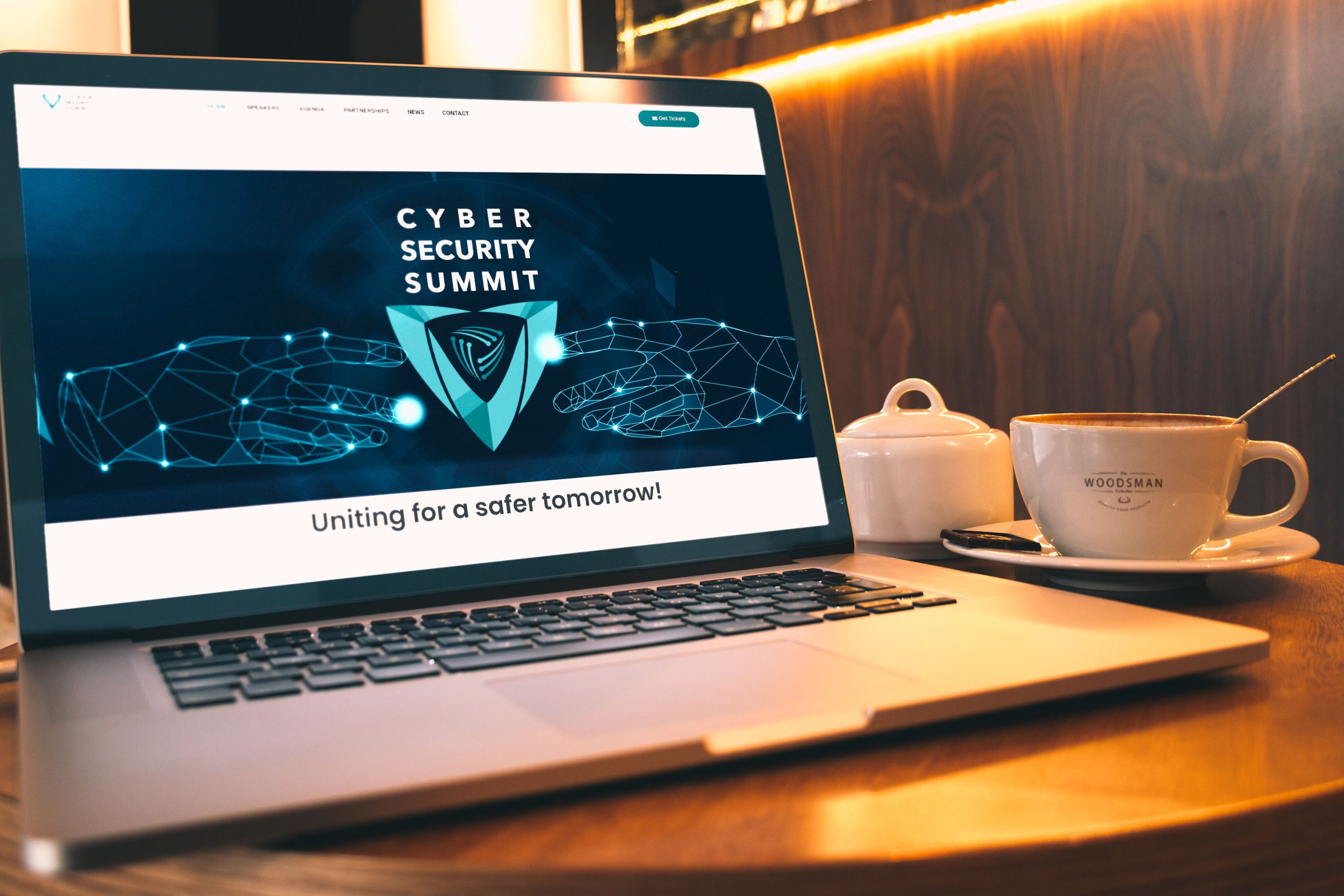
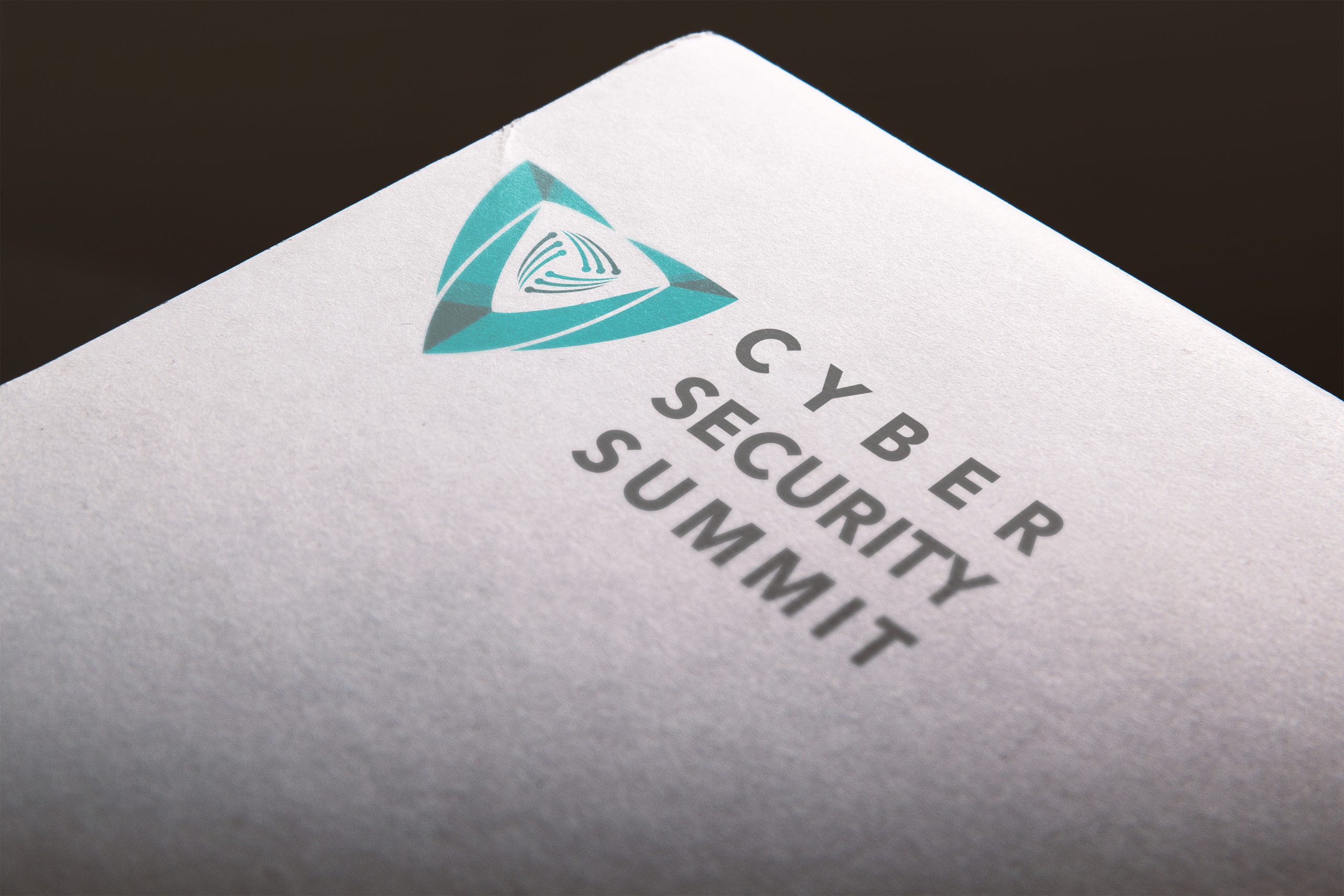
5. Mockup Creation: Generating mockups of the finalised logo design in various contexts, such as business cards, letterheads, website headers, and social media profiles. Mockups provided a realistic preview of how the logo would appear in different applications.
6. Final Approval: Presenting the refined logo design to stakeholders, including the client’s team, for final approval and feedback. Incorporating any last-minute adjustments or suggestions to ensure satisfaction and alignment with the summit’s branding objectives.
The designing of the symbol(s) phase marked the culmination of the logo development process, resulting in a polished and impactful visual representation of the Cyber Security Summit’s identity and values.
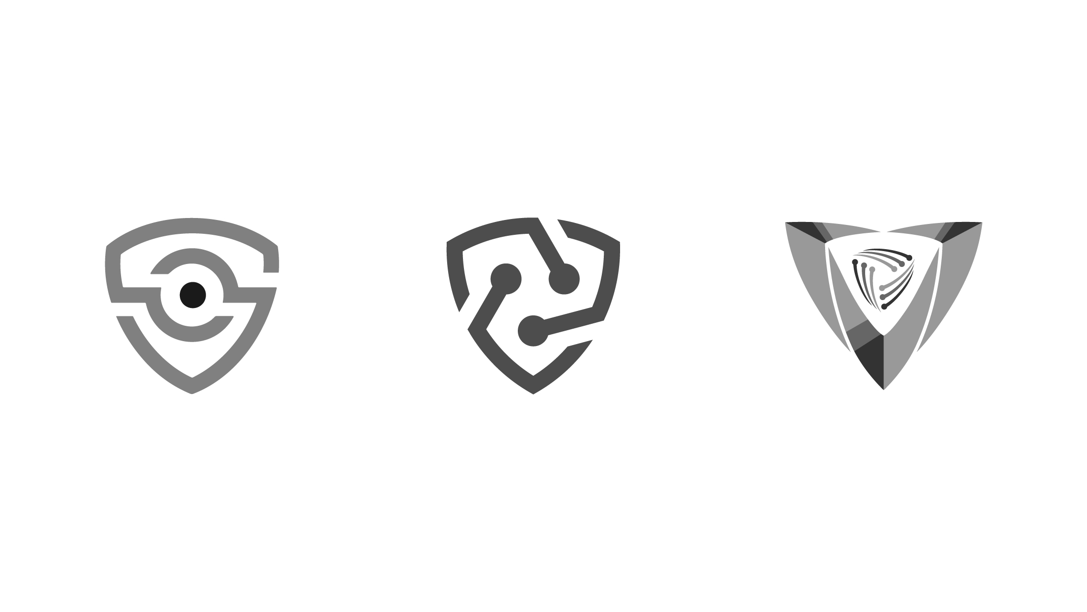
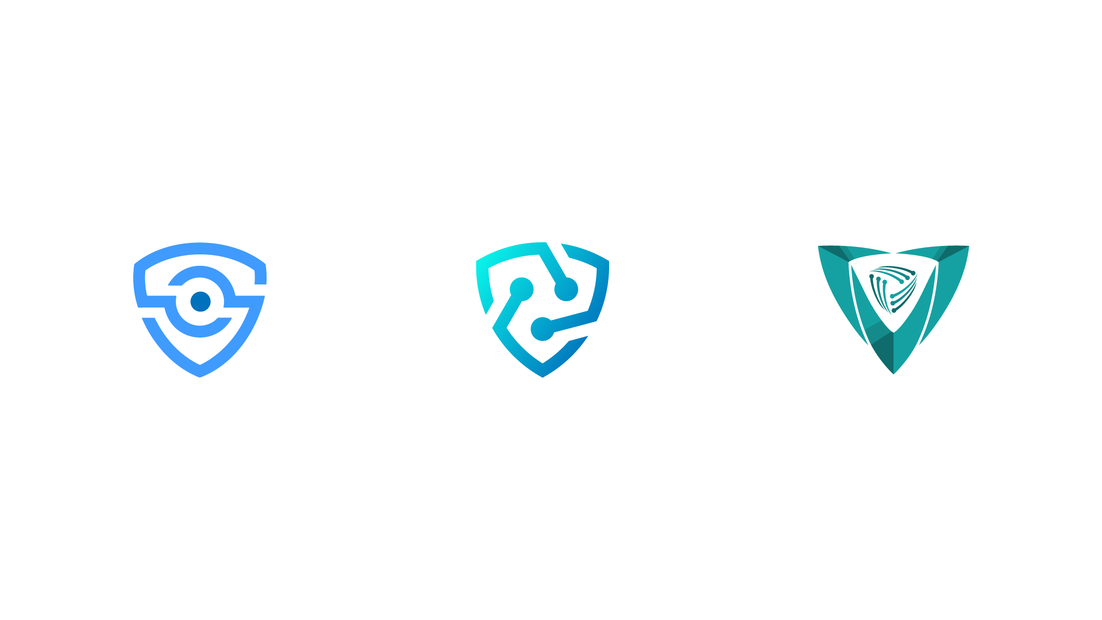
Proposed Logomarks
Phase 6:Iterative Refinement
The Iterative Refinement phase focuses on making final adjustments and enhancements to the logo design based on feedback, testing, and stakeholder input. Key activities in this phase included:
1. Feedback Integration: Incorporating feedback received during the final approval stage, addressing any concerns or suggestions from stakeholders to enhance the logo’s effectiveness and alignment with the summit’s objectives.
2. Testing and Evaluation: Conducting thorough testing of the logo design across different media and platforms to ensure visual consistency, scalability, and readability. Testing also included assessing the logo’s legibility in various sizes and backgrounds.
3. Accessibility Considerations: Ensuring the logo design meets accessibility standards, such as colour contrast ratios for readability and inclusivity. Adjusting colour combinations or element placement if necessary to improve accessibility.
4. Optimisation for Digital Platforms: Optimising the logo design for digital platforms, including websites, social media profiles, and mobile applications. Ensuring that the logo remains clear and impactful in digital formats and responsive design environments.
5. Final Revisions: Making final revisions and refinements to the logo design based on testing results, feedback implementation, and stakeholder approval. Fine-tuning details such as spacing, alignment, and colour accuracy for a polished and professional appearance.
6. Documentation and Guidelines: Creating documentation and brand guidelines that outline the proper use, placement, and sizing of the logo across different applications. Providing guidelines ensures consistency and maintains the logo’s integrity in various contexts.
The Iterative Refinement phase ensures that the logo design for the Cyber Security Summit is visually compelling, technically sound, and aligned with branding standards. It marks the final stage before the logo’s official launch and implementation across summit materials and communications.
Phase 7: Application and Versatility
Once the logo design for the Cyber Security Summit received final approval from stakeholders, it was time to implement the logo across various materials and platforms. This phase focuses on ensuring the logo’s versatility and effectiveness in different applications. Key activities in this phase include:
1. Digital Assets: Creating high-resolution digital files of the approved logo design in formats such as PNG, JPEG, SVG, and AI. These files are optimised for use in digital platforms, including websites, social media profiles, email signatures, and online advertisements.
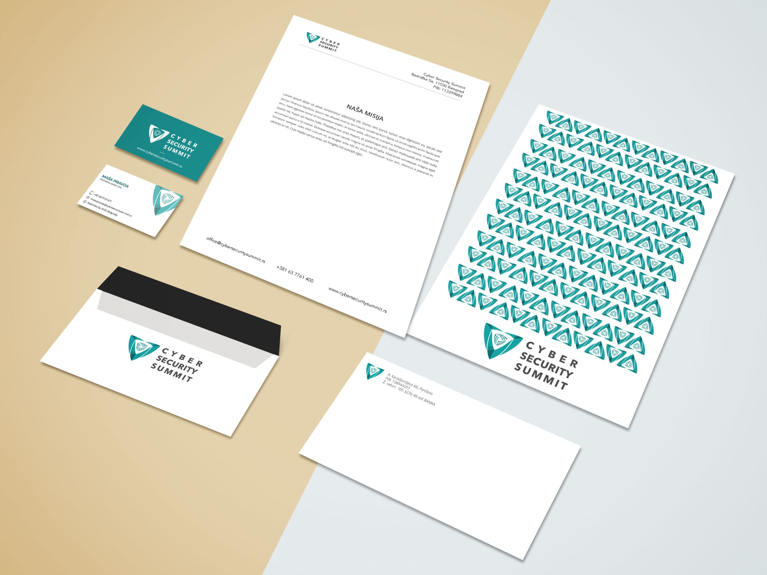
2. Print Materials: Adapting the logo design for print applications, such as business cards, letterheads, brochures, banners, posters, and promotional merchandise. Ensuring that the logo retains clarity and visual impact when reproduced in print formats.
3. Colour Variations: Developing colour variations of the logo design for different backgrounds and contexts. This may include a full-colour version for digital use, a grayscale version for print in black and white, and a monochrome version for single-colour applications.
4. Size and Scaling: Establishing guidelines for resizing and scaling the logo design while maintaining legibility and visual integrity. Providing specifications for minimum and maximum sizes to ensure optimal visibility across various media.
5. Usage Guidelines: Documenting usage guidelines and brand standards for the logo design, including clear space requirements, minimum size rules, color codes, typography guidelines, and usage restrictions. Distributing these guidelines to stakeholders and design partners to maintain consistency and brand cohesion.
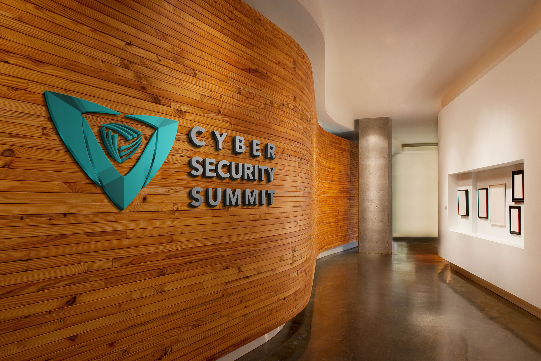
6. Mockups and Visualisations: Creating mockups and visualisations of the logo design applied to different materials and environments. This includes showcasing how the logo appears on business cards, letterheads, digital screens, merchandise, event signage, and promotional materials.
7. Feedback and Monitoring: Seeking feedback on the application of the logo design from stakeholders and target audience members. Monitoring its usage across various channels and platforms to ensure compliance with brand guidelines and visual consistency.
By focusing on application and versatility, the Cyber Security Summit’s logo design becomes a powerful visual asset that effectively represents the event’s identity, values, and message across diverse mediums and communication channels.
CSS Stationery proposal
Web Cover proposal
Conclusion
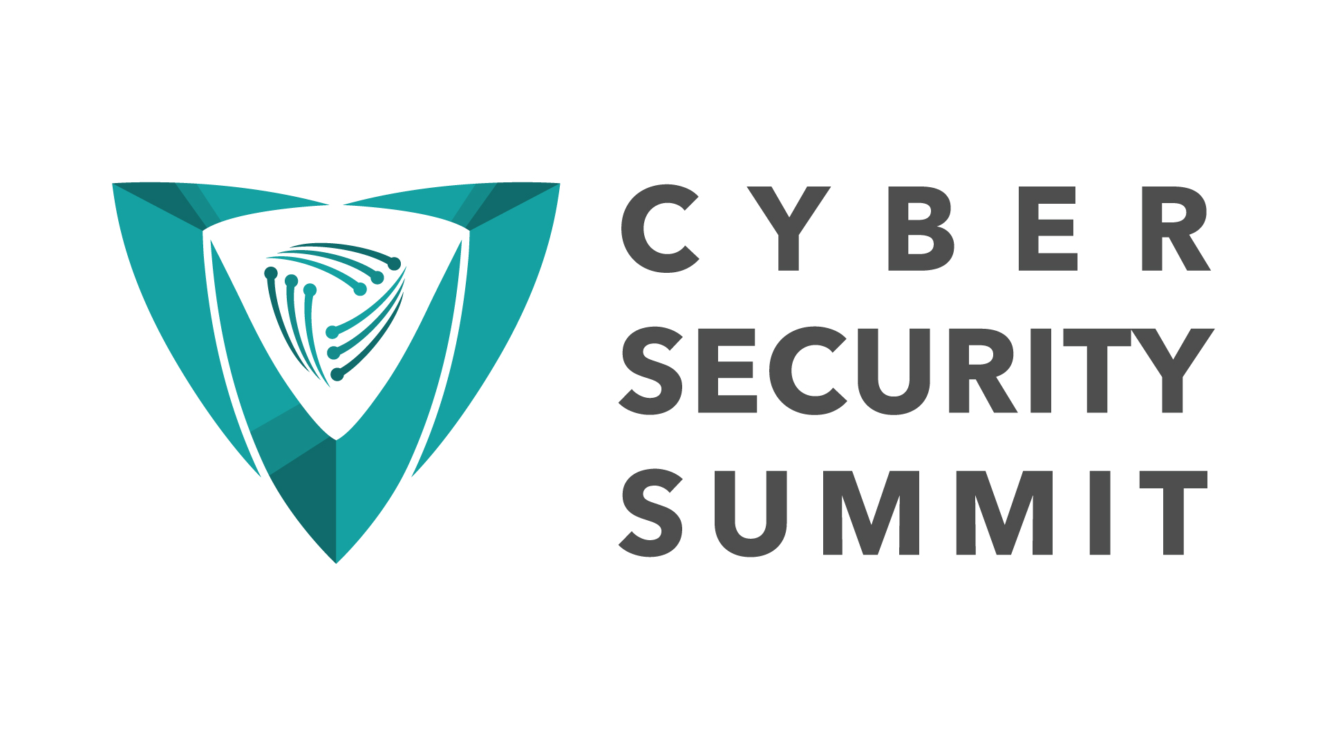
The final logo successfully encapsulates the essence of the Cybersecurity Summit. The shield with diodes, coupled with the chosen tagline and colour palette, creates a visually compelling and meaningful representation of their commitment to building a secure digital future. The logo serves not only as an emblem for the summit but as a symbol that unifies cybersecurity professionals and communicates their collective dedication to a safer tomorrow.
Summary and Future Plans
The Cyber Security Summit’s logo development journey has been a collaborative and strategic process, encompassing various phases from understanding the client brief to stakeholder approval and feedback. Here’s a summary of the key highlights:
1. Client Brief: The initial phase involved understanding the client’s objectives, target audience, theme, and key messages for the Cyber Security Summit.
2. Research: Extensive research was conducted on cybersecurity trends, regional context, audience preferences, competitor analysis, symbolism, and design elements.
3. Creative Direction: The creative direction focused on symbolism, colour palette, typography, tagline integration, and visual impact aligned with cybersecurity themes.
4. Brainstorming and Conceptualisation: Multiple design concepts were generated, refined, and developed into detailed proposals based on research insights and creative direction.
5. Designing the Symbol(s): The selected logo concept underwent digital rendering, symbol refinement, typography integration, color application, mockup creation, and final adjustments.
6. Iterative Refinement: Feedback, testing, accessibility considerations, and final revisions were incorporated to ensure the logo’s effectiveness and suitability across different applications.
7. Application and Versatility: The approved logo design was applied across digital assets, print materials, colour variations, size scaling, usage guidelines, mockups, and feedback monitoring to ensure versatility and visual consistency.
Moving forward, future plans for the Cyber Security Summit include:
– Implementing the logo design across summit materials, including website, social media platforms, email communications, event signage, merchandise, and promotional materials.
– Launching the summit with a cohesive visual identity that resonates with cybersecurity professionals, industry stakeholders, and the target audience.
– Monitoring and maintaining brand consistency in logo usage, adhering to brand guidelines, and seeking continuous feedback for improvement.
– Leveraging the logo design to enhance brand recognition, promote the summit’s mission and values, and foster collaboration within the cybersecurity community.
The Cyber Security Summit’s logo serves as a symbol of unity, innovation, and security, reflecting the summit’s commitment to a safer digital future and collaborative efforts in the cybersecurity landscape.
Related Posts
May 4, 2025
Case Study: Cherish Visual Identity
Step-by-step walkthrough of the Visual identity crafting for Cherish Visual…
March 25, 2024
Free DIY Logos and Why They’re Bad for Business
The allure of taking the DIY route may seem like a cost-effective and rapid…
March 15, 2024
Crafting Compelling Logos: The Psychology of Shapes and Colours in Design
Crafting Logos and the psychological implications of shapes and colours in…


