Branding project for a Senior’s home ‘Cherish‘ , based in Belgrade, which aims to provide a unique approach to care and create a people-focused community.
Cherish company approached me with a distinctive mission – to create a complete Visual identity that encapsulates their vision:
Respect for the individual, maintaining and protecting their dignity and quality of life.
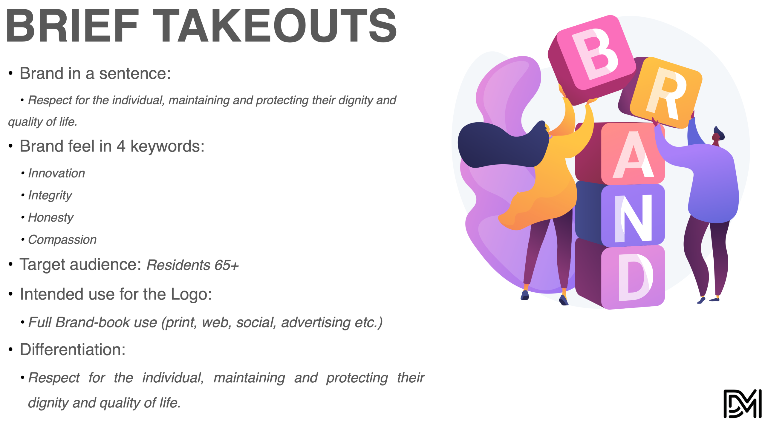
1. Client Brief
Cherish is a premium senior care provider that embodies a deeply humanistic approach to aging. At the heart of the brand is a mission to offer not just care, but an elevated quality of life—founded on dignity, respect, and emotional connection. Cherish aims to redefine senior living by moving beyond traditional models of elderly care and creating custom-built environments that feel like home. With thoughtful interior design, holistic well-being programs, and highly personalized services, Cherish positions itself as more than just a residence; it’s a place of continued growth, belonging, and meaningful experiences.
What sets Cherish apart is its commitment to compassion and excellence. The company’s ethos revolves around building emotionally intelligent environments where residents are not just passive recipients of care, but active participants in their community. Every element—from spatial design to staff training—is crafted with a sensitivity to the nuanced needs of seniors, promoting independence, trust, and genuine connection. This forward-thinking approach is what fuels the brand’s visual identity development.
The client’s brief was focused on developing a visual identity that would reflect these core values in an authentic, elegant, and emotionally resonant way. The brand needed to speak to a dual audience: the elderly individuals who would inhabit the spaces and the families and decision-makers who would ultimately choose Cherish over competitors. This meant that the design had to strike a balance between professional sophistication and emotional warmth.
Key themes included the ideas of protection, empathy, continuity, and premium quality. The logo and supporting visuals were expected to embody a sense of human touch while maintaining a polished, trustworthy aesthetic. Cherish also highlighted the need for a flexible system—one that could carry across digital platforms, physical signage, printed collateral, and even architectural applications within their facilities.
The target audience spans several key demographics:
- Primary: Seniors aged 65+ seeking a comfortable, respectful, and community-driven living environment.
- Secondary: Family members (often in the 40–60 age range) involved in the selection of care facilities.
- Tertiary: Stakeholders such as healthcare professionals and potential investors who value a brand committed to long-term, holistic elder care.
This foundation set the stage for a strategic, emotionally intelligent visual identity that not only represents what Cherish offers—but how it makes people feel.
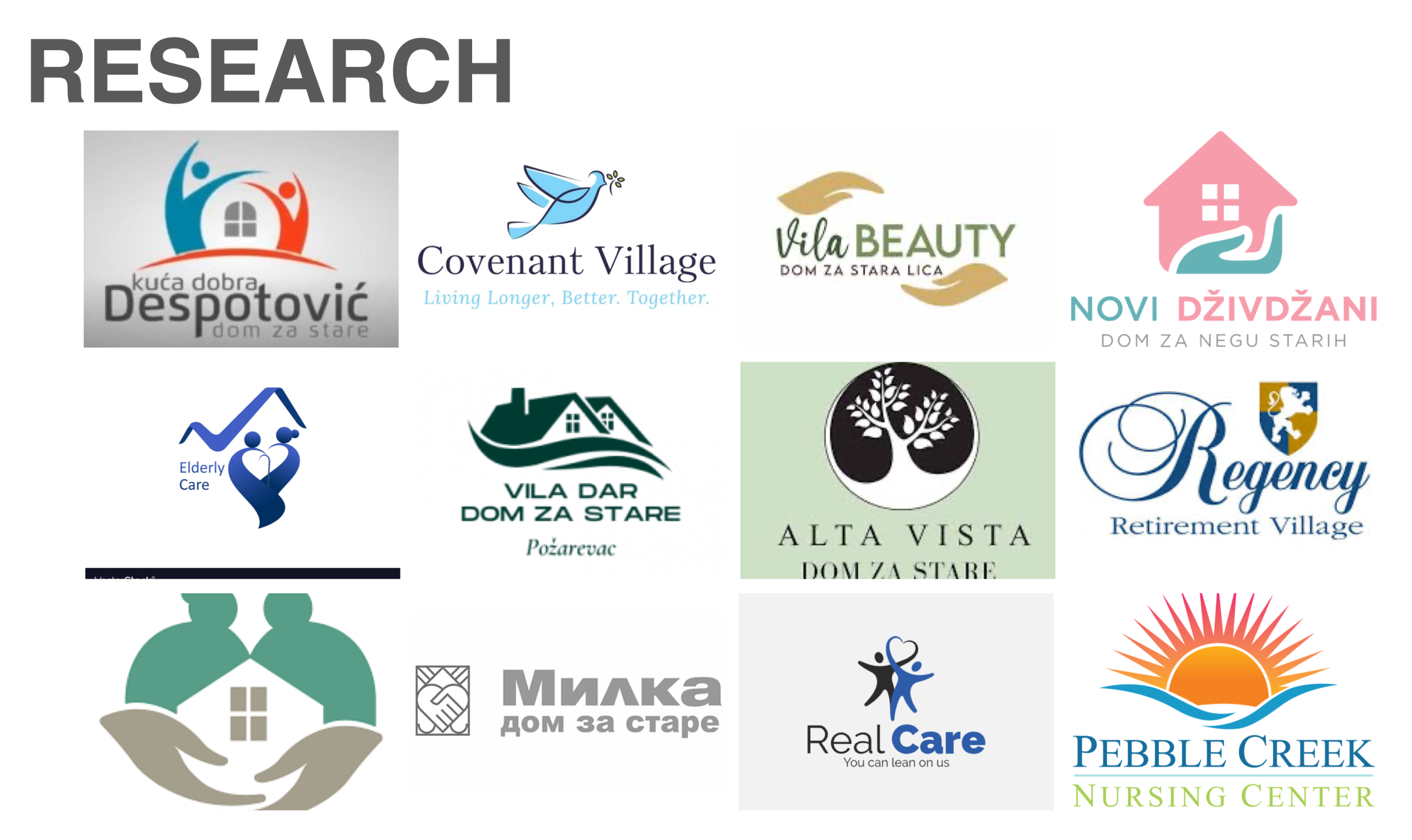
2. Research
Building a visual identity for Cherish required a thoughtful, research-driven process aimed at understanding both the practical needs of the brand and the emotional landscape of its audience. Research began with a deep dive into the senior care industry, focusing on visual trends, symbolism, emotional triggers, and communication strategies used by competitors. The goal was not to imitate, but to identify opportunities for differentiation and authenticity in a market that often leans toward the clinical or overly sentimental.
One of the earliest insights was the clear gap between how most care homes present themselves—sterile, impersonal, or overly corporate—and what families and residents actually want: warmth, empathy, and trust. This disconnect shaped our decision to ground the identity in human-centric visuals and storytelling. We examined not just design aesthetics, but the psychological and emotional associations that certain colors, symbols, and typography evoke. For example, while blue conveys reliability, too much of it can feel cold. A carefully curated palette of warm neutrals, gentle golds, and soft greens emerged as a way to visually communicate comfort and premium care without veering into clichés.
We also conducted an audit of direct and indirect competitors. While some high-end providers use sleek, minimalist branding to suggest sophistication, they often lack an emotional connection. Others emphasize family and connection but fall short on professionalism and polish. Cherish needed to strike a rare balance—inviting and tender, yet modern and refined.
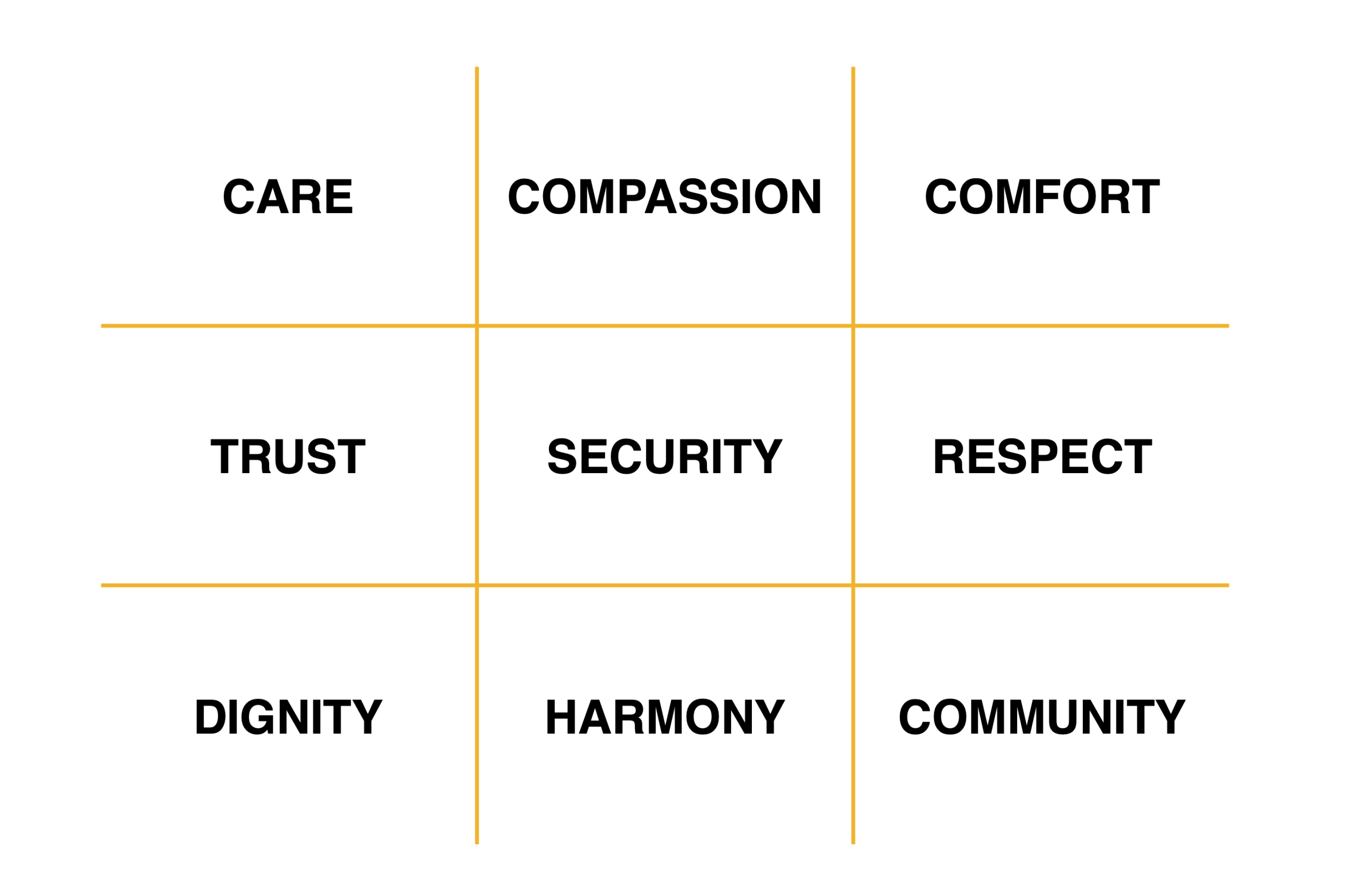
Key Concepts and Symbols
- Hearts & Hands: Signifying compassion, connection, and support.
- Infinity & Circles: Communicating stability, continuity, and inclusiveness.
- Nature Elements (Trees, Flowers, Sunrises): Signaling growth, peace, and beauty.
- Butterflies & Puzzle Pieces: Reflecting transformation, harmony, and community.
Color & Typography Insights
- Warm tones: Soft reds, golds, and creams express warmth and comfort.
- Cool tones: Blues and greens provide calmness and trust.
- Typefaces: Serif or rounded fonts bring elegance and accessibility.
Through this research, we identified emotional and aesthetic elements that resonate with both seniors and their families, ensuring both empathy and clarity in the brand’s presence.
Symbolically, we explored imagery tied to care, growth, and continuity. Icons such as hearts, open hands, and circles were not only visually versatile but also carried universal emotional meaning. The heart, for instance, speaks to love and connection, while an open hand signifies trust and support. The infinity symbol suggested lasting commitment, and circular motifs implied unity and wholeness. These motifs were considered not just for their emotional resonance but also for their scalability across brand touchpoints.
Equally important was understanding the audience: seniors and their adult children. Seniors value dignity, familiarity, and subtle beauty; their children, often making the final decision, prioritize safety, professionalism, and emotional well-being. The research phase helped ensure that the brand could appeal to both groups without alienating either.
Ultimately, the research laid a solid strategic foundation for design—one that was informed, empathetic, and aligned with Cherish’s vision of reimagining senior living with heart.
To build an effective identity, we explored visual cues that speak directly to trust, warmth, and longevity—qualities vital to elder care branding.
Research takeaways
CyberSecurity Mood Board
3. Creative Direction
The creative direction for Cherish needed to visually capture the brand’s dual essence: its status as a premium provider of senior care and its deeply compassionate, human-centered philosophy. Rather than approaching the identity as a single, fixed aesthetic, the creative team explored two core pathways that aligned with Cherish’s values and audience expectations. These directions were developed to give the brand flexibility in tone and application while ensuring it remained emotionally resonant and instantly recognizable.
Direction 1: Premium Custom Care Plan
This route emphasized elegance, luxury, and bespoke attention. It was inspired by high-end hospitality and boutique healthcare environments—spaces that evoke trust through tasteful design and refined visual cues. This direction envisioned Cherish as the “gold standard” of elder care: custom-built environments, personalized wellness programs, and services that feel more like hospitality than healthcare.
Visually, this approach relied on a muted and sophisticated color palette—champagnes, warm greys, soft golds—paired with serif or semi-serif typefaces to convey tradition and excellence. Photography in this direction was curated to showcase serene, thoughtfully designed spaces, with seniors enjoying independent moments in beautifully lit environments. The message was clear: here, aging is not something to endure, but something to be lived with grace and dignity.
Direction 2: People-Oriented Visuals
The second direction embraced the emotional side of the brand, capturing real human moments, connection, and care. This concept positioned Cherish not just as a facility, but as a community—a space where stories are shared, friendships flourish, and love is present in everyday interactions.
Visual elements leaned toward soft shapes, rounded fonts, and organic lines. The color palette here included warmer hues—peach, soft lavender, and comforting earthy tones. Photography centered on candid moments: a caregiver gently holding a resident’s hand, a family laughing during a visit, a group enjoying an activity together. This visual storytelling was intended to evoke empathy, trust, and the sense that Cherish is a place where people are truly seen and valued.
Both creative directions were rooted in the brand’s promise of exceptional care, but each offered a different lens: one polished and aspirational, the other emotional and grounded. Importantly, they weren’t mutually exclusive. Elements from both were designed to be blended across touchpoints depending on audience context—whether speaking to potential residents, families, or stakeholders. This duality ensures that the Cherish brand can grow with nuance, always centered on the core values of dignity, empathy, and excellence.
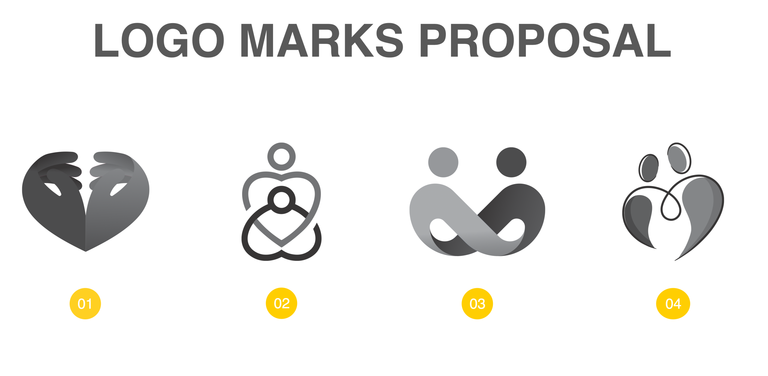
Key visual elements for the Logomark

4. Conceptualisation for the Logomark
The development of the Cherish logomark was one of the most delicate and strategic aspects of the visual identity process. It required distilling the brand’s emotional richness and premium positioning into a simple, timeless mark—something instantly recognizable, deeply symbolic, and flexible enough to live across signage, uniforms, printed materials, and digital platforms.
At the heart of the name “Cherish” lies an emotional verb: to hold dear, to care for with intention, to protect something meaningful. This essence became the foundational idea for the logomark exploration. The challenge was to capture that sentiment visually—without leaning into clichés or overused care symbols.
Core Symbol Themes
Through visual brainstorming and iteration, four conceptual directions for the logomark emerged, each reflecting a unique angle of the brand’s personality and promise:
- Cherish as a Heartwarming Mark
This route explored soft heart shapes and abstract forms that gently suggested love, connection, and care. Rather than using literal hearts, subtle linework and negative space were employed to allude to warmth and intimacy in a more sophisticated manner. - Cherish as a Caring Mark
This direction focused on hand-like forms and protective enclosures—symbols that evoke comfort, support, and nurturing. These shapes represented the human element of care, whether through curved lines mimicking an embrace or nested forms symbolizing protection and companionship. - Cherish as Human Connection
Inspired by the relationships formed within senior living communities, this option used interlocking forms, circular chains, or abstract figures to signify unity, partnership, and emotional closeness. It aimed to communicate the brand’s belief that meaningful relationships are central to well-being. - Cherish as Unity
This route drew from natural and spiritual symbols—circles, infinity loops, and radiating lines—to convey continuity, wholeness, and a life well-lived. These visuals also nodded to cycles of care and growth, reinforcing Cherish’s holistic approach to elder living.
Across all explorations, attention was paid to ensuring the logo would scale effectively and maintain clarity in both large and small applications. The chosen concept had to be minimal, timeless, and visually resonant—capable of standing alone or pairing seamlessly with the wordmark.
Typography was also carefully considered to complement the mark. A custom or slightly modified typeface with soft curves and humanistic traits helped maintain a sense of warmth while still signaling professionalism.
Ultimately, the logomark was designed to be more than a graphic—it became a symbol of a promise: that each life at Cherish would be honored, supported, and celebrated.
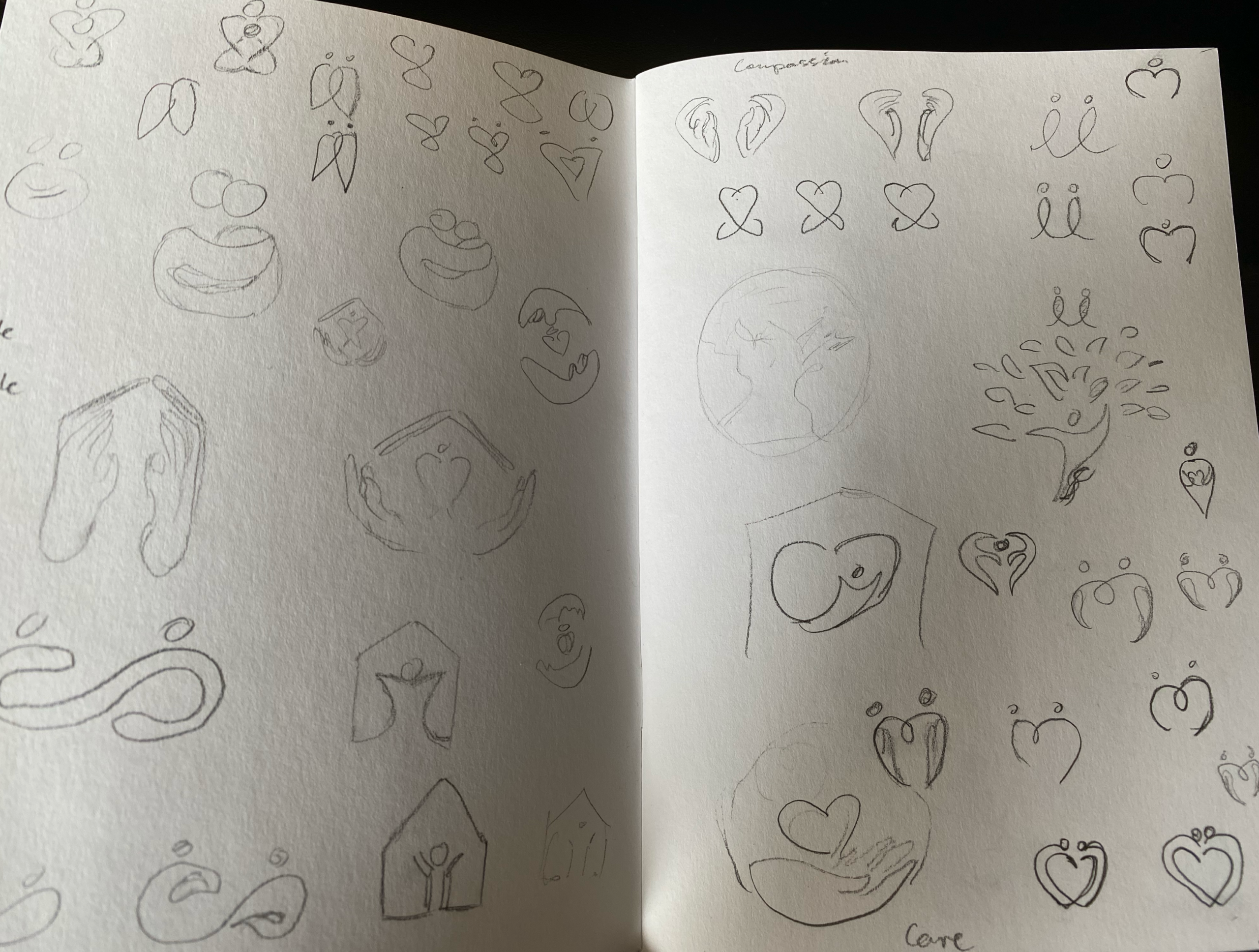

Logo concept sketches
5. Putting It All Together into a Visual Identity
Once the conceptual and strategic elements were in place, the next step was to synthesize them into a cohesive, adaptable, and emotionally resonant visual identity system for Cherish. This involved more than just designing a logo—it was about creating a full visual language that could consistently express the brand’s values across all touchpoints, from signage to digital presence to the smallest printed detail.
At the center of this identity is the logomark: a refined symbol that embodies the core themes of care, connection, and continuity. Paired with a thoughtfully selected typeface, the logo offers a balance between emotional warmth and premium elegance. The wordmark itself uses soft curves and humanistic proportions, chosen to evoke approachability without sacrificing professionalism. Together, the logo and wordmark serve as the face of the brand—clean, calm, and inviting.
The supporting color palette is intentionally soft and sophisticated. It combines warm neutrals, such as sand and soft cream, with gentle accents of blush pink, lavender, and sage green. These tones were selected for their emotional effects: warmth to foster comfort, coolness to instill calm, and balance to ensure visual harmony. The overall impression is soothing, grounded, and gentle—avoiding the overly clinical feel that dominates much of the elder care industry.
Typography plays a key role in reinforcing the brand’s tone of voice. A primary serif typeface with elegant proportions communicates trust and legacy, while a sans-serif companion font adds modernity and legibility, particularly in digital contexts. The typography system ensures clarity and accessibility for all ages, while maintaining a graceful aesthetic.
Imagery guidelines emphasize authenticity and emotion. Rather than stock photos or posed imagery, the Cherish brand showcases real moments: a resident enjoying a garden walk, hands clasped in conversation, or a warm interaction between staff and family members. These visual cues humanize the brand and foster a sense of connection.
Graphic elements such as soft lines, circular patterns, and open space echo the ideas of protection, continuity, and community. These subtle design details are used sparingly to enhance layouts without overwhelming the content.
The final result is a brand identity that feels both deeply human and quietly luxurious. It affirms Cherish’s commitment to respectful, dignified care, while positioning the brand as a forward-thinking leader in the senior living space. This visual identity doesn’t just represent what Cherish does—it reflects how it makes people feel: safe, seen, and truly cherished.

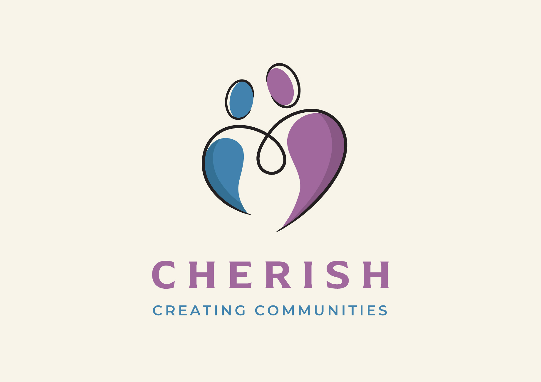
Proposed Logomarks
6. Conclusions
Tony Barnett (General Director of Cherish) had this to say about our collaboration on this project:
We were very fortunate to be introduced to Damir by a mutual friend who was highly complementary about Damir and his work.
Damir from the offset demonstrated a highly professional approach combined with a natural creative flair. He enquired about our vision for the company and after actively listening to our ideas guided us with his calm, patient and engaging style through the process of creating our visual identity. What started out as a simple need for a logo developed into a journey of discovery about our brand.
The whole experience of working with Damir on our visual identity was both rewarding and enjoyable. We are looking forward to continuing our partnership with him has we further develop our brand.
I have no hesitation in recommending Damir to anyone seeking to develop a visual identity that truly reflects their brand.
Final Logo design
Final thoughts
The final logo design successfully encapsulates the essence of Cherish as a human connection mark – unity, inclusivity, and protection.
Related Posts
Case Study: CyberSecurity Summit Visual Identity
Step-by-step walkthrough of the Visual identity crafting for CyberSecurity…

Free DIY Logos and Why They’re Bad for Business
The allure of taking the DIY route may seem like a cost-effective and rapid…
Crafting Compelling Logos: The Psychology of Shapes and Colours in Design
Crafting Logos and the psychological implications of shapes and colours in…