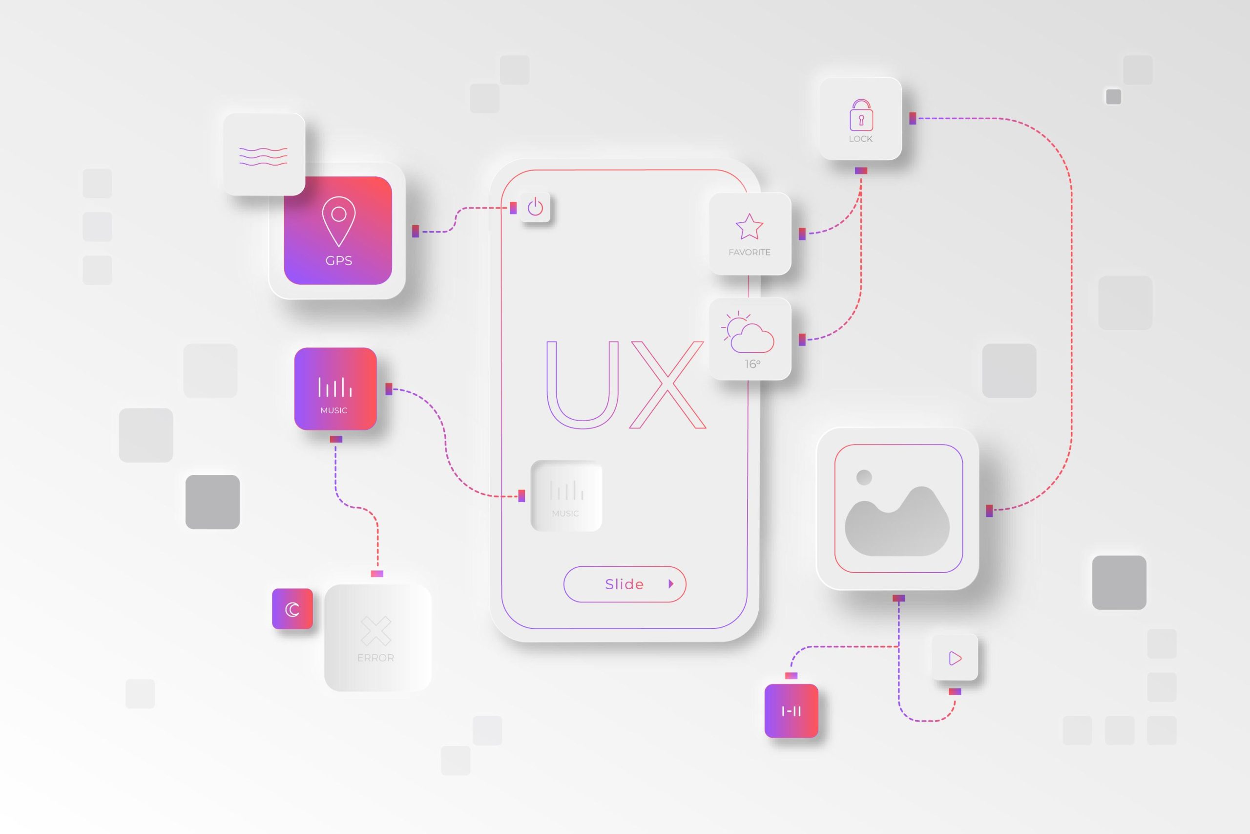
n a world of dashboards, conversion metrics, and endless backlog refinements, it’s easy for product managers to lose sight of the most crucial variable in every decision: the human being on the other side of the screen. Empathy Mapping is one of the simplest, yet most transformative tools that brings that human element back into focus.
For product managers navigating complex digital ecosystems — apps, platforms, and services — it bridges the gap between ‘data-driven insight’ and ‘emotion-driven design’, transforming vague personas into vivid, actionable user understanding.
What Is an Empathy Map?
An empathy map is a ‘collaborative visualisation tool’ used to articulate what a user ‘says, thinks, does, and feels’ while interacting with a product or service. It helps teams align around a deeper understanding of their users — not as statistics, but as people with motivations, frustrations, and emotional landscapes.
Originally popularised by Dave Gray of XPLANE, the empathy map has evolved into a core part of UX research and product discovery. Its power lies in its simplicity: a single sheet divided into key quadrants representing facets of human experience.
A typical empathy map includes:
* Says: What the user verbally expresses during interviews, feedback sessions, or usability tests.
* Thinks: What the user is likely thinking — unspoken assumptions, concerns, or beliefs.
* Does: Observable behaviours, actions, and habits.
* Feels: Emotional states that drive or block the experience (frustration, delight, anxiety, excitement).
Many teams add two complementary sections — ‘Pains’ and ‘Gains’ — to connect emotional understanding to practical design outcomes: what hurts, and what would make things better.
Why Empathy Mapping Matters for Product Managers
As a product manager, you’re constantly balancing ‘stakeholder goals, technical constraints, and user needs’. Empathy mapping gives structure to that balance by grounding every roadmap discussion, design sprint, or feature prioritisation in the real human context behind your metrics.
Here’s how it supports product leadership:
1. Transforms Data Into Human Insight
Metrics reveal *what* users do, but not *why*. Empathy mapping complements analytics by providing emotional context. For instance, your dashboard might show a drop-off in onboarding; empathy mapping reveals that users feel ‘overwhelmed’ or ‘insecure’ during the setup flow. That emotional nuance transforms a generic “UX problem” into a targeted improvement opportunity.
2. Aligns Cross-Functional Teams
Designers, developers, and marketers often interpret “user needs” differently. The empathy map becomes a shared canvas, helping everyone visualise the same person. It creates a common emotional language that aligns decisions across disciplines — no more abstract debates about “what the user wants.”
3. Informs Roadmaps and Prioritisation
Understanding pain points and emotional triggers helps prioritise features that matter most to users. For example, a PM might delay adding a new feature in favour of addressing a frustrating interaction that erodes trust — because the empathy map shows that frustration is the leading emotional barrier to retention.
4. Humanises Decision-Making
Empathy mapping reminds teams that behind every click is a cognitive and emotional experience. This not only leads to better design but cultivates a culture of ‘empathy-driven leadership’, where users’ emotions inform strategic decisions.

The Anatomy of an Empathy Map
An empathy map is typically created on a large board (digital or physical) divided into sections. Each quadrant corresponds to a distinct perspective on the user’s experience:

Let’s break down what goes into each part:
1. Says: The Voice of the User
Collect real quotes that capture the user’s authentic language. Instead of paraphrasing, use verbatim snippets from interviews like:
“I always forget my password — it’s such a hassle.”
These quotes humanise data and help teams empathise through the user’s actual voice. They also serve as powerful storytelling material when advocating for UX improvements.
2. Thinks: What’s Under the Surface
This section captures *mental models* — the way users conceptualise your product. They might be thinking:
“I’m not sure if this feature is worth paying for.”
“What happens if I click this button — will I lose my progress?”
These are often hidden assumptions that analytics can’t reveal. Identifying them helps you design clearer interfaces, better onboarding flows, and trust-building experiences.
3. Does: Observable Behaviour
List what the user physically does: clicks, swipes, backtracks, or abandons a form. This section connects emotional and cognitive insights with tangible actions. For example, “The user reopens the help center three times” might suggest confusion or lack of confidence.
4. Feels: The Emotional Journey
Here, emotions become data. Capture feelings like confusion, satisfaction, anxiety, excitement, or ‘relief’. Visualise how these fluctuate through key moments of the user journey — sign-up, checkout, or error recovery. This helps teams empathise with emotional peaks and valleys, designing smoother, more humane flows.

How to Create an Empathy Map: Step-by-Step
Step 1: Define Your Target User
Start with a clear user segment or persona. The empathy map works best when it represents a specific group, not “everyone.” For example, “first-time app users who abandoned the onboarding flow” or “returning players engaging with loyalty rewards.”
Step 2: Gather Raw Insights
Collect qualitative data from:
* User interviews and surveys
* Usability tests and screen recordings
* Customer support tickets and reviews
* Behavioural analytics with session replays
The goal is to collect authentic, emotional expressions — what users say, feel, and do — rather than generic statements.
Step 3: Facilitate a Workshop
Bring together your product, design, and research teams. Use a whiteboard (Miro, FigJam, or Notion board) and create four quadrants: ‘Says, Thinks, Does, Feels.’
Then collaboratively fill in sticky notes or digital cards with insights, quotes, or observations.
Encourage discussions like:
* “What assumptions might we be making?”
* “Where do users show signs of hesitation or frustration?”
* “What emotions dominate this part of the journey?”
Step 4: Identify Patterns
Once your map is filled, cluster similar insights to find themes. For example:
* Users feel anxious about data privacy.
* They’re confused about pricing transparency.
* They express delight when discovering quick wins.
These patterns are the heart of empathy mapping — they connect scattered observations into coherent user truths.
Step 5: Translate Insights Into Action
Use the empathy map to define ‘design implications’ or ‘product opportunities’.
For instance:
* If users “feel uncertain” → clarify microcopy and add feedback states.
* If they “say it’s complicated” → simplify flows or reduce steps.
* If they “think it’s not for them” → revisit your positioning and tone.
Every sticky note should lead to a design hypothesis or backlog item that enhances user satisfaction.
When to Use Empathy Mapping
Empathy maps are most effective at key product moments:
* During Discovery: To synthesise research findings before defining user personas.
* Before Ideation:*To align the team’s understanding of user motivations.
* During Sprint Planning: To ensure user pain points inform story prioritisation.
* In Post-Launch Reflection: To validate if the intended emotional experience matches reality.
Essentially, empathy mapping isn’t just a UX exercise — it’s a ‘strategic decision-making compass’ throughout the product lifecycle.

Common Mistakes to Avoid
1. Skipping Real Data
Empathy maps lose value if they’re based on assumptions. Always ground them in authentic user research.
2. Overgeneralising Users
Avoid “one-size-fits-all” users. Create separate empathy maps for different segments to maintain relevance.
3. Treating It as a One-Time Exercise
User emotions evolve. Revisit and update your empathy maps regularly — especially after major releases or market shifts.
4. Ignoring the Emotional Dimension
Teams often fill in “Says” and “Does” but neglect “Feels.” Emotions are where the insights hide.
5. Failing to Translate to Action
An empathy map is only valuable if it informs prioritisation, design choices, or user experience improvements.
How Empathy Maps Fit Into the Product Manager’s Toolkit
Think of the empathy map as the ‘bridge between user research and product strategy’. It complements tools like:
* Personas (who the user is)
* User Journey Maps (what the user experiences over time)
* Opportunity Solution Trees (how insights inform strategy)
For PMs, it becomes a ‘narrative anchor’ — a visual reminder of the “why” behind every feature, backlog item, or OKR.
When presented during sprint reviews or roadmap discussions, it re-centers the conversation:
“This feature exists to relieve this frustration. Here’s what our users said, thought, and felt.”
That’s the power of empathy in product leadership — not just understanding users, but advocating for them.

Empathy Mapping in Digital UX: Real-World Examples
* Onboarding Redesign: A fintech product found users ‘felt anxious’ about connecting bank accounts. Empathy mapping revealed trust as the emotional barrier. The team added transparent copy and visual reassurance, improving completion rates by 18%.
* Feature Adoption: A productivity app discovered users ‘thought’ premium features were too advanced for them. Empathy mapping helped simplify messaging, resulting in higher engagement.
* Game Experience (UX Example): A mobile game noticed high early churn. The empathy map showed that new players ‘felt confused and lost’, even though mechanics were simple. Reworking tutorials with better pacing and emotional feedback reduced drop-off dramatically.
In each case, the empathy map didn’t just describe users — it guided tangible business outcomes.
Conclusion: From Data to Empathy
Empathy mapping is more than a UX exercise; it’s a mindset. It pushes product managers to balance ‘quantitative data’ with ‘qualitative understanding’, transforming insights into emotionally intelligent products.
When we understand not just what users do, but how they ‘feel’ doing it, we create experiences that are more than functional — they’re human.
In an age of automation and analytics, empathy remains the most strategic differentiator.
Recommended Reading
1.“The Mom Test” by Rob Fitzpatrick
A must-read for product managers conducting user interviews. It teaches you how to ask unbiased, actionable questions that reveal genuine user problems instead of polite lies.
2. “Hooked: How to Build Habit-Forming Products” by Nir Eyal
Explores the psychology of user behaviour and how products can ethically design engagement loops. Great for connecting emotional triggers on an empathy map to behavioural design.
3. “Thinking, Fast and Slow” by Daniel Kahneman
A deep dive into how humans actually think — and why their decisions often contradict logic. Perfect for interpreting the “Thinks” and “Feels” quadrants of empathy maps.
4. “The User Experience Team of One” by Leah Buley
A practical field guide for PMs and UX professionals working in lean or hybrid environments — includes hands-on templates and workshop techniques, including empathy mapping.
5. “Indistractable” by Nir Eyal
Focuses on the other side of user engagement — how to respect attention, reduce cognitive friction, and build humane digital experiences that align with user intent.
Related Posts
Two Maps, One Destination: How User Journeys and User Flows Work Together in UX
They are different maps of the same landscape — one emotional, one……
Beyond the Screen: What Ethnography Teaches Us About UX Research
There’s a quiet moment in every great user interview — when the questions fall…

From First Click to Conversion: A Step-by-Step Guide to Landing Page Design That Works
A landing page is more than a piece of web real estate — it’s a stage where…