A landing page is more than a piece of web real estate — it’s a stage where first impressions decide everything.
Within seconds, a visitor either connects with your message or clicks away forever.
Designing an effective landing page isn’t about throwing visuals and copy together until something “looks good.” It’s about understanding psychology, guiding emotion, and crafting clarity. Every pixel and phrase has a purpose: to move someone from curiosity to action.
Let’s walk through the design process step by step — from defining intent to refining the details — and explore how great landing pages are built not by chance, but by choice.
Step 1: Define the Goal
Every landing page begins with a single, crystal-clear question:
“What do I want visitors to do here?”
That might sound obvious, but lack of clarity is the number one reason landing pages underperform. A page trying to accomplish too much ends up doing nothing well.
Is your goal to capture email signups, sell a product, get demo requests, or promote an event? Each one demands a different structure, tone, and level of information.
Defining the goal is also about aligning expectations — if the ad or link that led users here promises something specific, your page must deliver that instantly. Anything less creates friction and breaks trust.
A landing page without a goal is a story without an ending. Decide the action first; design everything else around it.
Step 2: Understand the Audience
Once you know the goal, you must understand who it’s for.
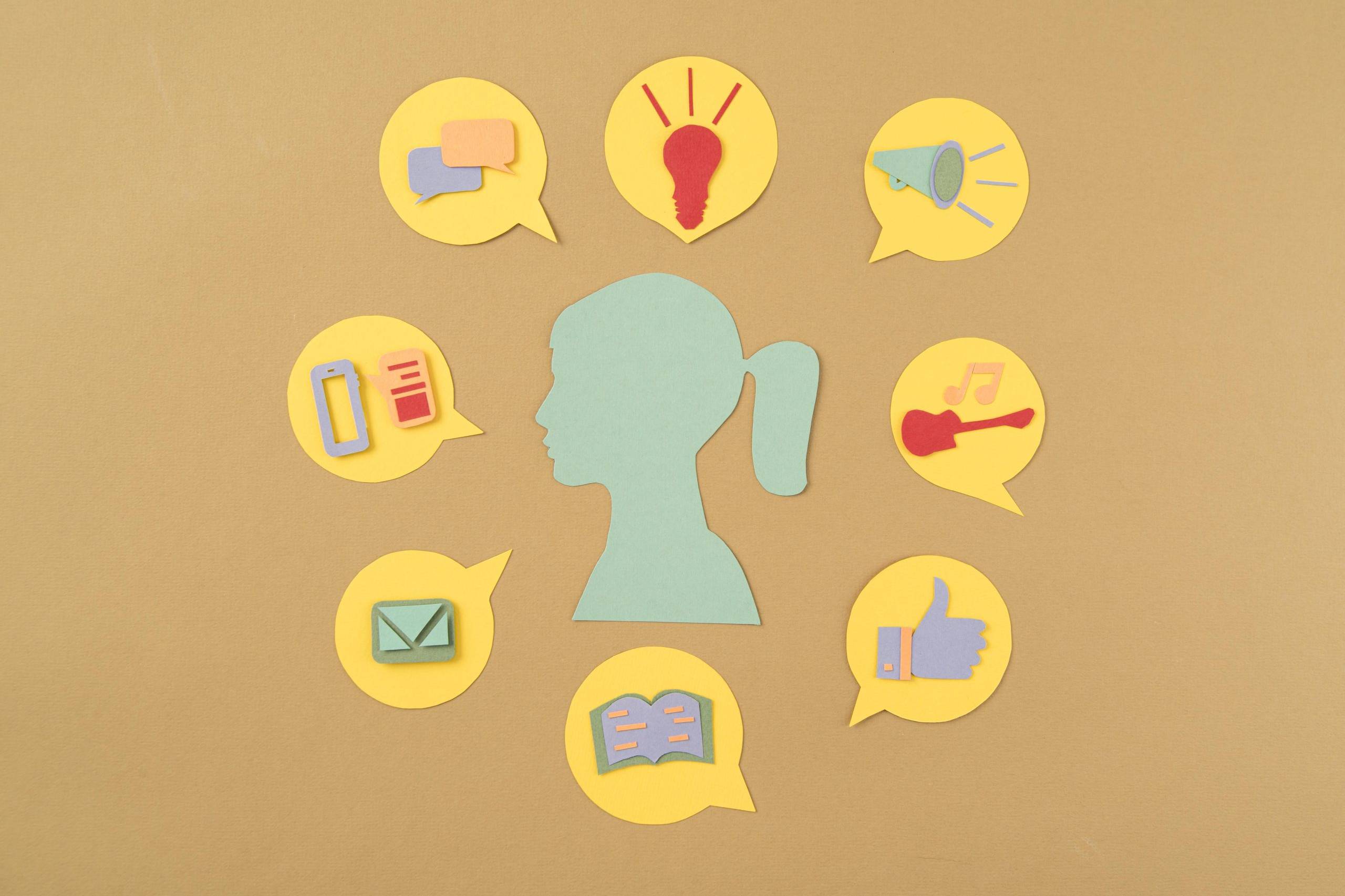
UX design always begins with empathy — knowing not just demographics, but desires, fears, and motivations. What’s the visitor hoping to achieve? What’s stopping them?
For a SaaS landing page, your user might crave simplicity and proof. For an e-commerce product, emotion and visual appeal matter most. For a non-profit, it’s trust and authenticity.
Personas and empathy maps help here, but observation is even better: listen to customer feedback, watch user sessions, read support tickets. These reveal not what people ‘say’ they want, but how they actually behave.
Because at its heart, design is translation — converting human needs into visual logic.

Step 3: Craft the Value Proposition
Your value proposition is the heartbeat of the page. It must answer, within seconds:
“Why should I care?”
Visitors decide whether to stay or leave almost instantly. That decision depends less on beauty and more on clarity.
The formula is simple:
* Headline: State the benefit.
* Subheadline: Clarify the offering.
* Visual proof: Show it in action.
Think of it as an elevator pitch at the speed of a glance.
Avoid jargon. Replace buzzwords with plain language that focuses on outcomes, not features.
Don’t say “Next-generation analytics platform.” Say “See what’s driving your business — instantly.”
The best value propositions blend rational and emotional appeal. They don’t just explain WHAT your product does; they express WHY IT MATTERS.
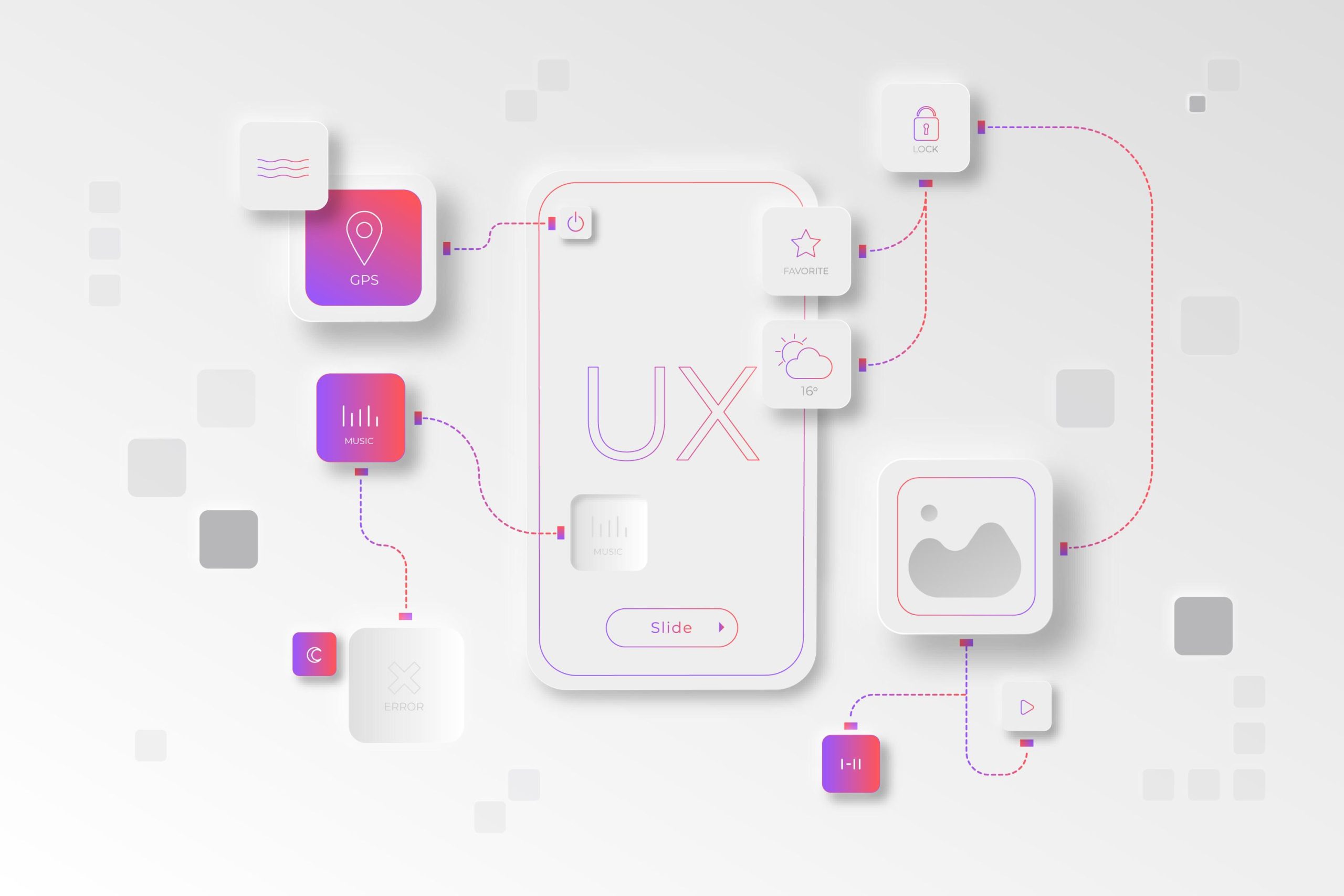
Step 4: Structure the Layout
A landing page isn’t read — it’s scanned. Users follow visual cues before reading a single line of text.
That’s why structure matters more than decoration. Use visual hierarchy to guide the eye naturally:
Hero → Benefits → Social Proof → CTA → Supporting Details.
Most people read in an ‘F-pattern’ (on desktop) or ‘Z-pattern’ (on mobile), so place key messages where eyes naturally travel.
Use whitespace generously. It’s not empty; it’s breathing room. Proximity, alignment, and contrast create rhythm and flow — classic Gestalt principles in action.
The most elegant pages feel effortless because they direct attention without shouting.
Each section should answer a single question and lead gracefully to the next.

Step 5: Design for Emotion and Trust
Visual design doesn’t just decorate — it persuades. Colour, imagery, and typography all influence emotion long before words are read.
Choose colours that align with the feeling you want to evoke: blues for trust, greens for calm, oranges for energy. Use typography that matches your tone — modern sans for innovation, serif fonts for credibility, playful type for approachability.
And remember: authenticity trumps polish.
Users sense when imagery feels staged. Real people, real environments, real results — these build emotional resonance.
Then add the trust signals that quiet hesitation:
* Testimonials and case studies
* Customer or partner logos
* Security badges or certifications
Credibility is conversion’s quiet partner. Without it, even the most beautiful page feels hollow.
Step 6: Optimise Copy and Calls to Action
If your visuals guide attention, your words guide action.
Every line of copy on a landing page should do one of two things: build trust or drive conversion. Nothing else.
Your CTA (call to action) is the culmination of that effort. It should be clear, specific, and framed around benefit.
Compare:
❌ “Submit”
✅ “Get My Free Trial”
✅ “Start Designing Today”
Good CTAs reduce cognitive load — users shouldn’t have to wonder what happens next.
Microcopy around buttons and forms helps too:
“Cancel anytime,” “Takes 30 seconds,” “No credit card required.” These tiny reassurances build comfort and commitment.
Limit choices. Every extra button or link divides attention. Focus on one primary goal per page. When everything is important, nothing is.

Step 7: Mobile-First and Performance
In 2025, over 70% of web traffic comes from mobile — so your landing page must ‘perform’ as beautifully as it looks.
That means:
* Load time under three seconds.
* Forms that work effortlessly with thumbs, not mice.
* Legible typography and touch-friendly spacing.
Simplify navigation, minimise text blocks, and test on real devices.
Core Web Vitals — like LCP (Largest Contentful Paint) and CLS (Cumulative Layout Shift) — aren’t just Google metrics; they’re user experience measures. Fast, stable pages make users feel respected.
In short: design for reality, not just for retina screens.
Step 8: Test, Measure, Iterate
A landing page is never finished. It’s a living hypothesis — one you continuously test against user behaviour.
Run ‘A/B tests’ for headlines, imagery, or CTA placement. Track ‘scroll maps’ to see where attention drops off. Use analytics dashboards to connect page behaviour to conversion goals.
Testing isn’t just about optimisation — it’s about discovery. Sometimes the version you like least performs best because it aligns better with how people actually think.
As design thinker Jared Spool once said,
“Good design, when done well, becomes invisible. It’s only when it’s done poorly that we notice it.”
Iteration makes your design invisible — because it feels natural.
Step 9: Tell a Cohesive Story
Beyond steps and structure, remember this: every landing page is a ‘story’.
From headline to button, you’re guiding a narrative — one that begins with curiosity and ends with confidence.
The user arrives as a skeptic and leaves as a believer. That transformation doesn’t happen through pixels or code, but through coherence: visuals, copy, and emotion all saying the same thing in the same tone.
Consistency is persuasion.
And simplicity is trust.

Conclusion: The Art of Clarity
Great landing pages aren’t born from templates. They’re shaped through empathy, psychology, and refinement.
They respect attention. They speak human. They remove doubt.
Because in the end, design isn’t just about how something looks — it’s about how it feels to understand it.
When visitors arrive and think, “Yes, this makes sense,” you’ve done more than design a page. You’ve created connection.
Every headline, every button, every gap of white space is part of a silent conversation between you and your audience — one that says: ‘We understand what you need, and we made this for you.’
That’s the moment where clicks become conversions and where design becomes trust.
Further Reading
1. “Don’t Make Me Think” – Steve Krug
A must-read on usability and clarity in design.
2. “Made to Stick” – Chip & Dan Heath
How to make messages memorable — a goldmine for landing page copy.
3. “Hooked” – Nir Eyal
Understanding behavioural triggers that keep users engaged.
4. “Building a StoryBrand” – Donald Miller
The art of storytelling in marketing and design.
5. “Conversion Optimisation” – Khalid Saleh & Ayat Shukairy
Practical methods to analyse and improve landing page performance.

Related Posts
Empathy Mapping: The Hidden Framework Behind Human-Centred Product Decisions
Empathy Mapping is one of the simplest, yet most transformative tools that…
Two Maps, One Destination: How User Journeys and User Flows Work Together in UX
They are different maps of the same landscape — one emotional, one……
Beyond the Screen: What Ethnography Teaches Us About UX Research
There’s a quiet moment in every great user interview — when the questions fall…