Apex Maintenance
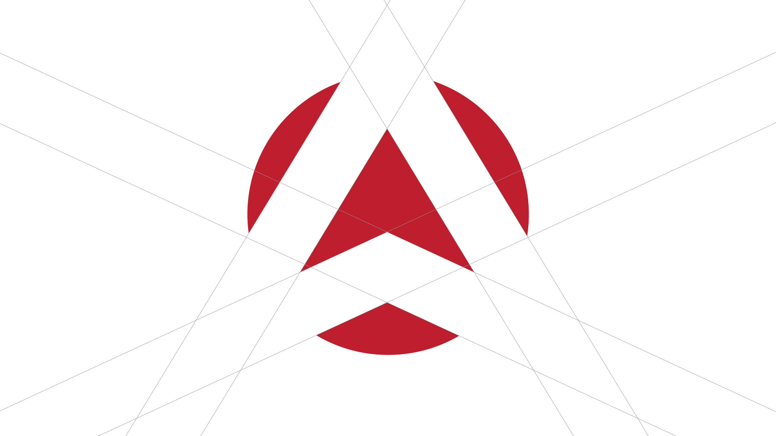
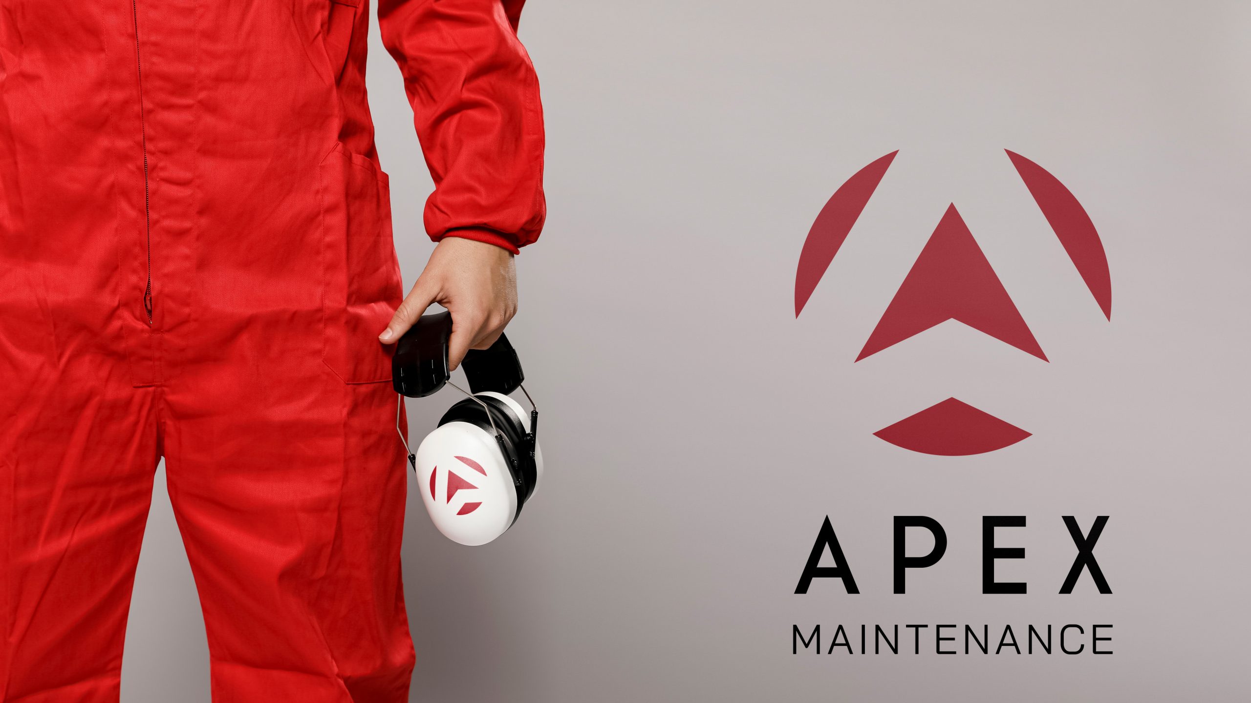
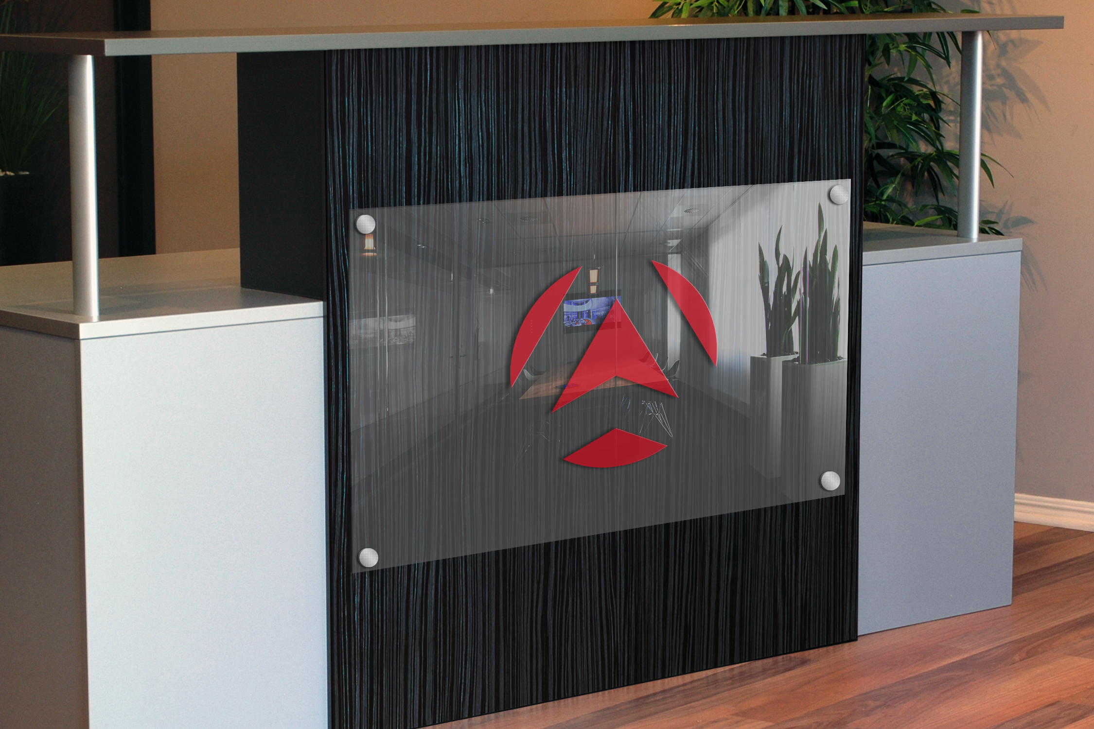
The logo design for Apex Maintenance embodies the concept of ascent and apex, reflecting the company’s focus on elevating standards in elevator maintenance. The logomark features a symbol that represents upward movement, symbolizing progress and achievement. This visual element not only communicates the company’s expertise in escalator maintenance but also conveys a sense of reaching new heights and striving for excellence. The design captures the essence of ascending to the top, mirroring Apex Maintenance’s commitment to delivering top-notch services in the industry.
In addition to symbolizing ascent and apex, the logo design for Apex Maintenance embraces a modern approach to their work. The clean and contemporary design elements reflect the company’s commitment to staying at the forefront of technological advancements and industry standards. The typography chosen for the logo complements this modern aesthetic, conveying professionalism and reliability. Together, the visual elements and typography create a logo that not only represents Apex Maintenance’s core values but also resonates with their target audience, positioning them as a leading and innovative player in the escalator maintenance industry.
ClientApex MaintenanceServicesLogo Design, BrandingYear2018
