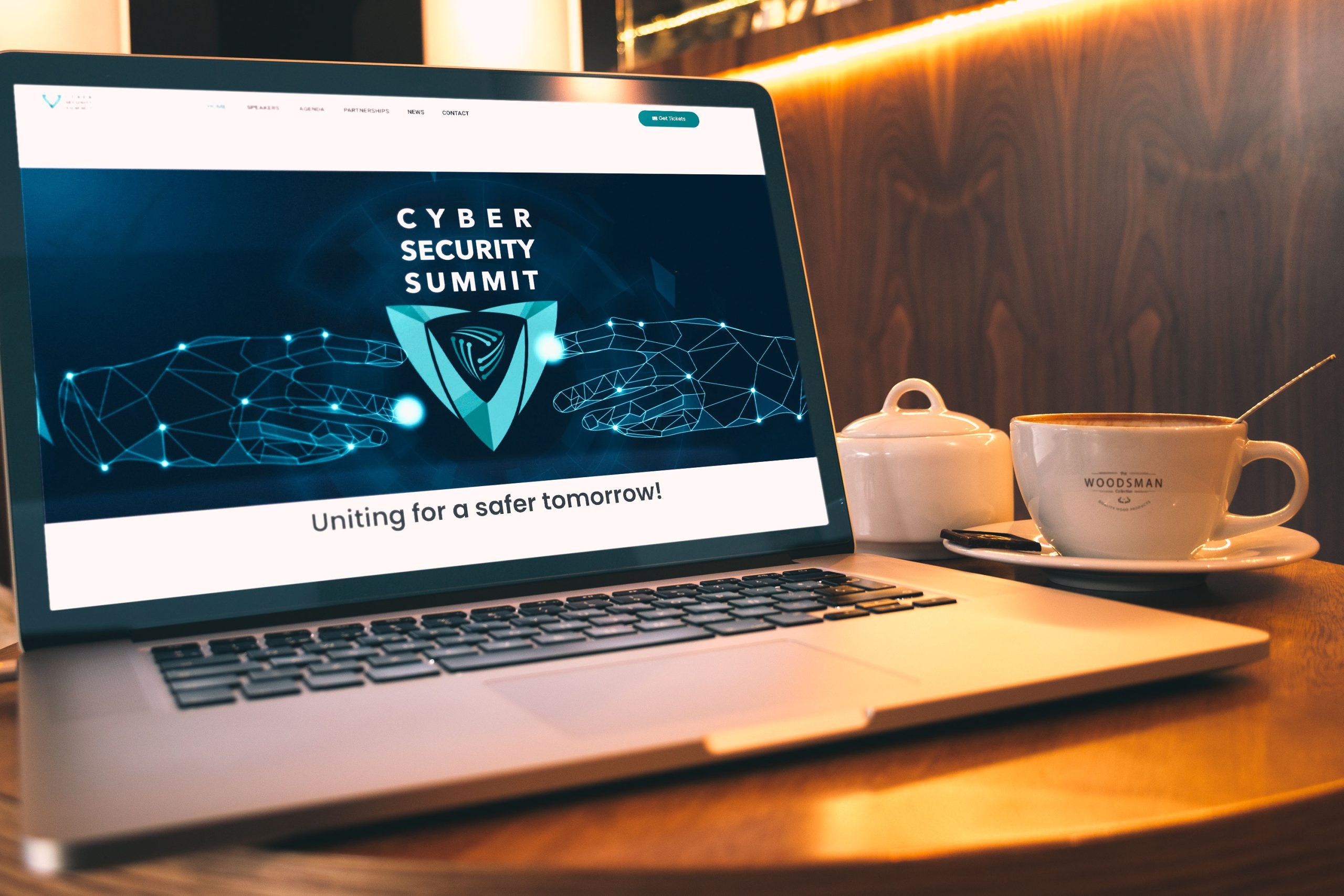
Branding done for an event organisation 'Cyber Security Summit' , based in Belgrade, aiming to bring together some of the top-notch experts in the industry in Southeast Europe.
Client
Cyber Security Summit
Year
2024
Services
Visual Identity
Web Design/Development
Website
cybersecuritysummit.rs
Words - to - image
The CyberSecurity Summit organisation approached me with a distinctive mission – to create a logo that encapsulates their dedication to uniting cybersecurity professionals in Southeast Europe. The goal was not just to design an emblem but to visually communicate their commitment to collaboration, knowledge sharing, and innovation in the realm of cybersecurity.
The identity part was straightforward – a Cybersecurity Summit, a regional conference dedicated to uniting cybersecurity professionals in Southeast Europe.
The Cybersecurity Summit’s diverse audience, from industry professionals to the general public, necessitated a logo that could resonate with various stakeholders while conveying a sense of security, collaboration, and innovation.
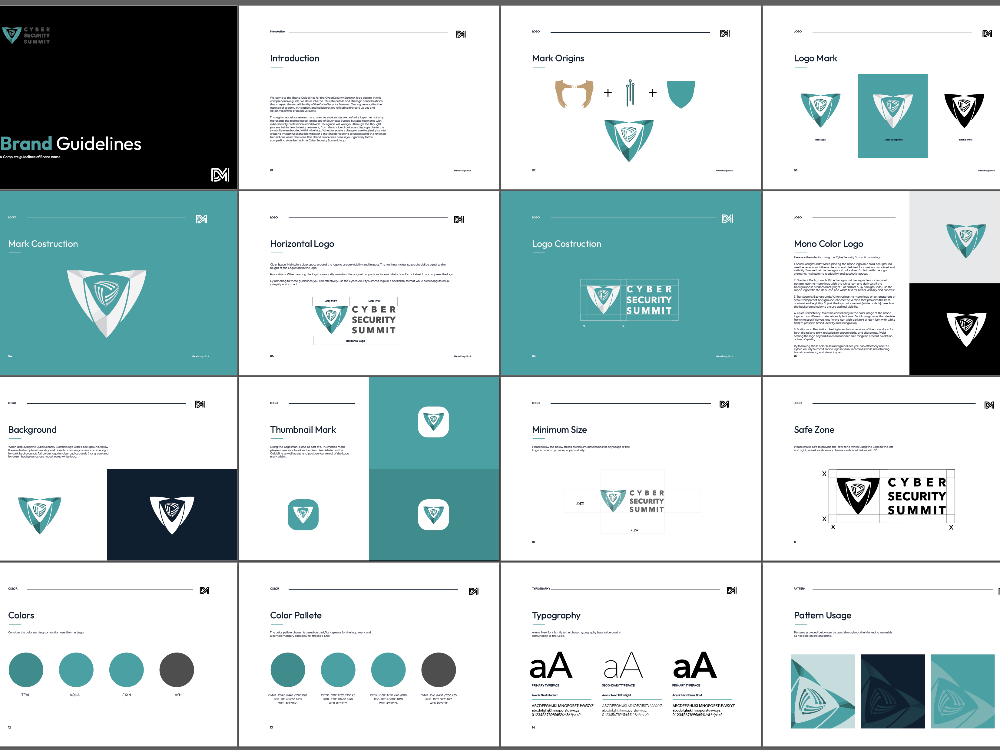
Pantone® 3415u
C88 M40 Y54 K18
#0E6B6B
Pantone® 339c
C82 M26 Y45 K3
#15A3A3
Pantone® 3395c
C78 M14 Y40 K0
#148C8C
Pantone® 446c
C65 M58 Y57 K36
#4D4D4D
⸺ Research
In the research phase, I delved into the world of cybersecurity, Southeast Europe's technological landscape, and the existing visual identities of similar conferences. This research provided valuable insights into colour preferences, symbolism, and design elements relevant to the industry.
⸺ Strategy
Armed with insights from the research phase, I embarked on defining the creative direction for the Cybersecurity Summit logo. Having outlined key elements that would encapsulate the essence of the event – collaboration, knowledge sharing, and innovation.
⸺ Conceptualisation
I explored various concepts and visual elements that could represent these values effectively. The tagline "United for a safer tomorrow" became a pivotal element, guiding the design choices.
This phase laid the foundation for the visual identity, setting the stage for the subsequent design process.
⸺ Symbol
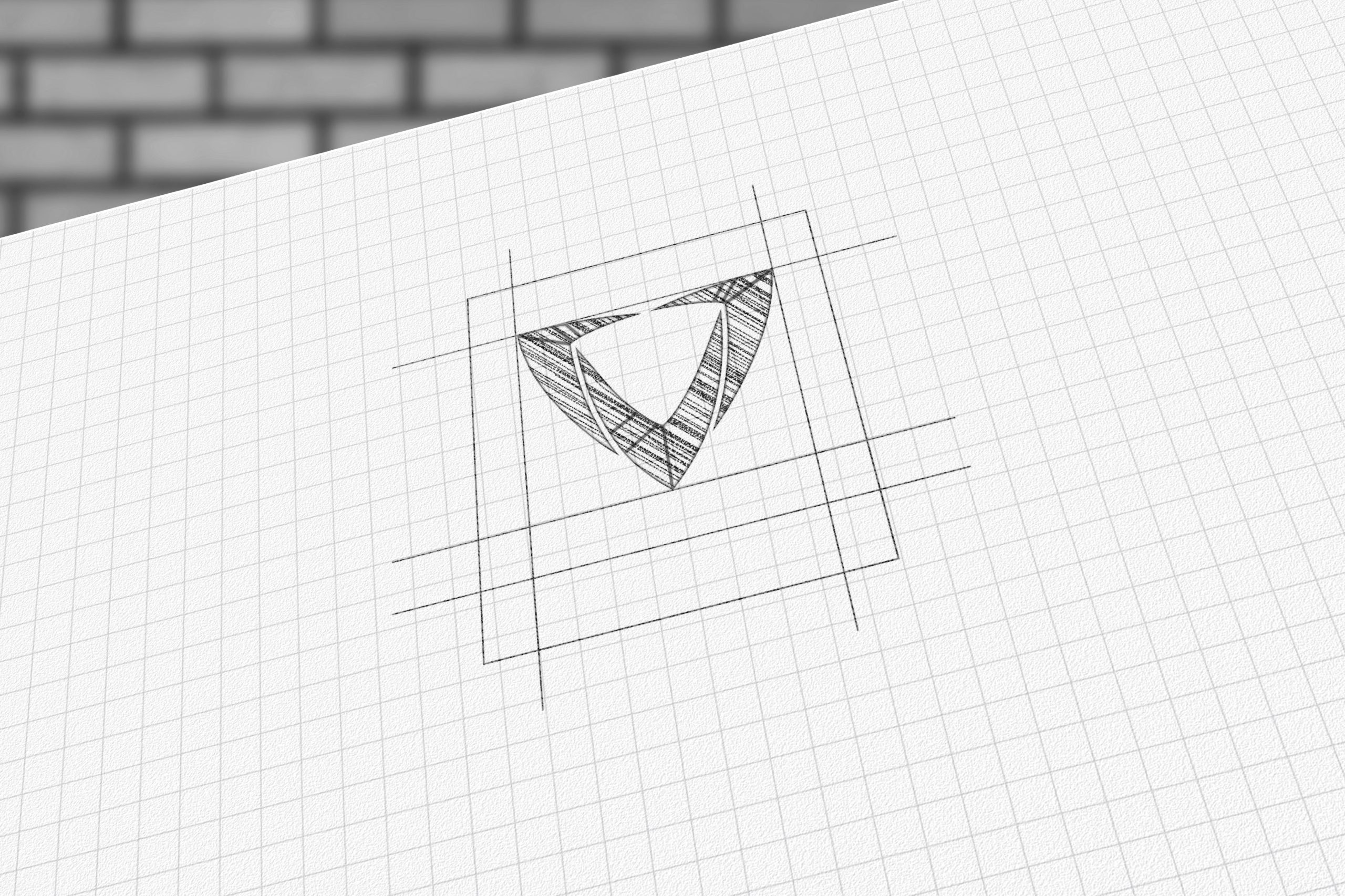
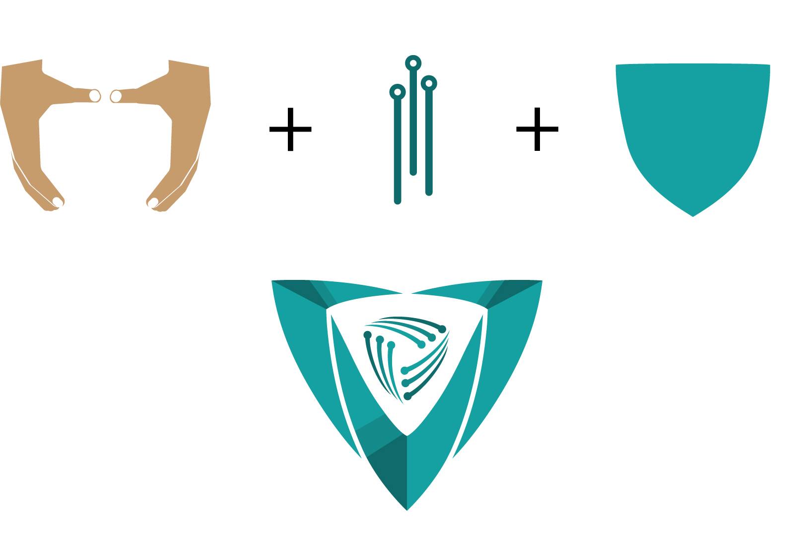
I decided to try and breakdown the shield itself as a symbol of protection and have two human hands as a point of inspiration that could act like a shield which signifies protection, while the diodes represent the interconnectedness and technological aspect of cybersecurity.
⸺ Typography
Choosing a clean, modern font like Avenir for the text ensured readability and a contemporary feel. Alternatively, the tagline "Uniting for a safer tomorrow" offered a longer yet impactful version for certain applications.
⸺ Colour
Deep variations of greens were employed to evoke a sense of trust, security, and technological sophistication. The grey for the text portion of the logo reinforces the strength of the whole image. These colours are commonly associated with security and professionalism.
