Dana Mills Photography
Dana steps into her own
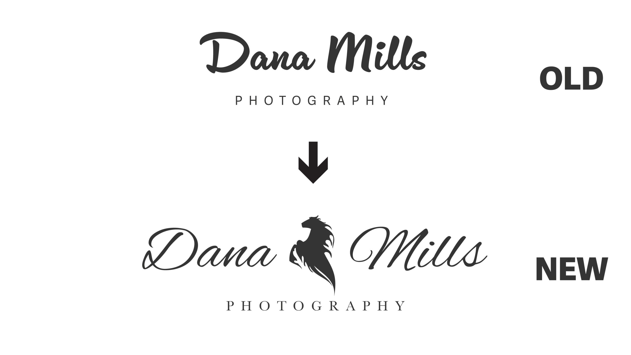
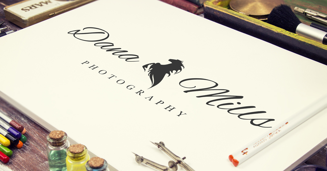
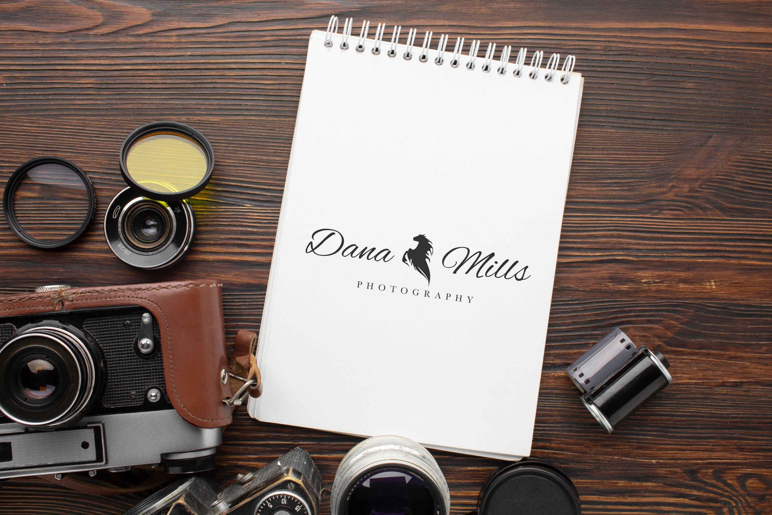
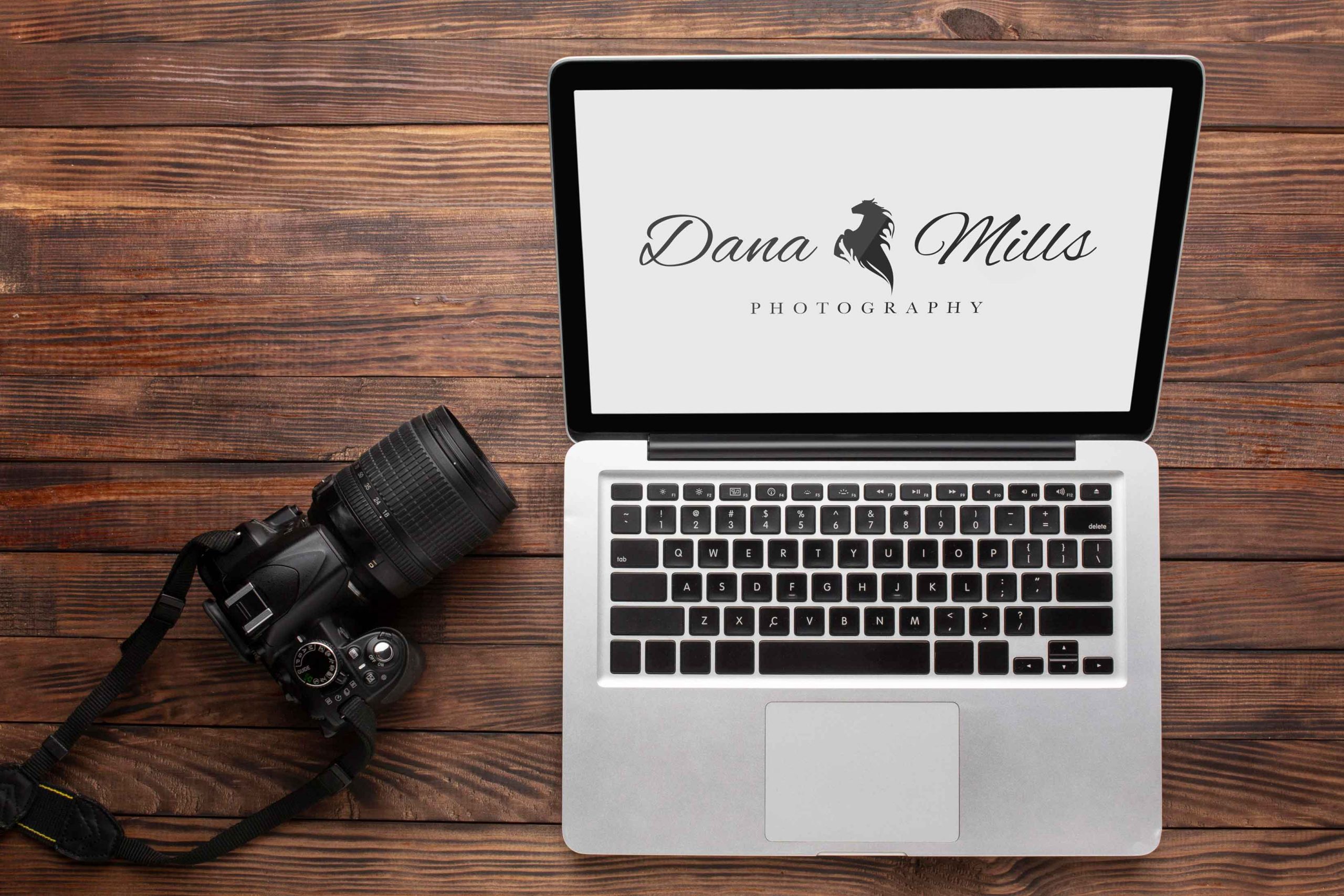
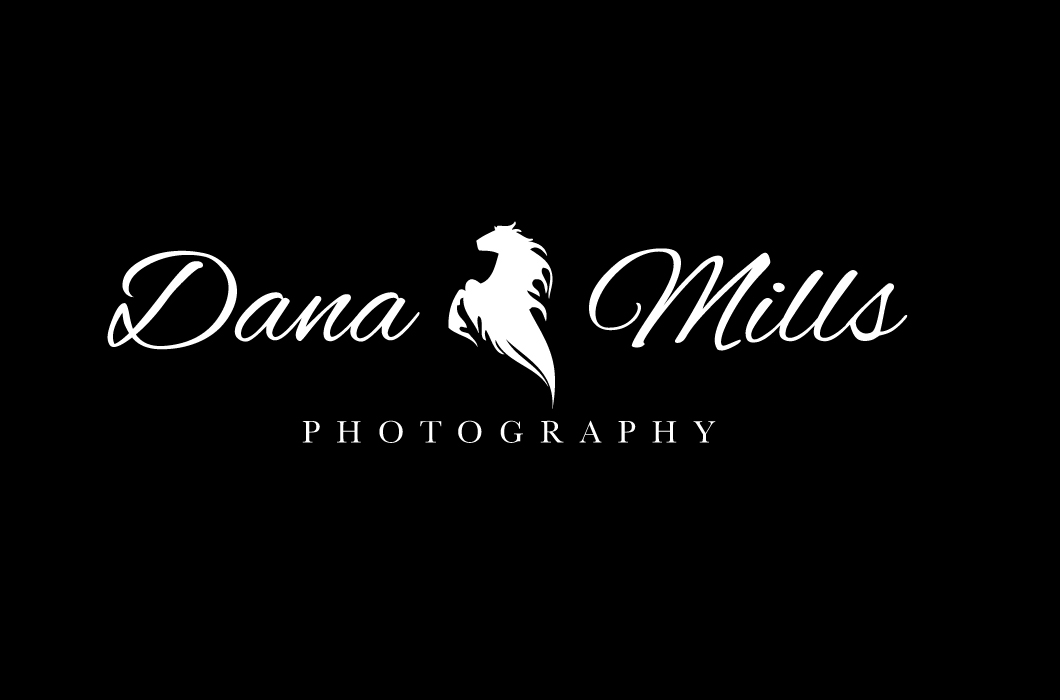
For Dana Mills Photography’s rebranding, the focus was on capturing the essence of equestrian photography while refreshing the visual identity from a generic and outdated look. The logo design incorporated a horse image seamlessly integrated into the overall composition, symbolizing Dana Mills’ specialization in capturing moments within the equestrian world. This imagery not only adds a distinct visual element but also communicates the core theme of the photography niche.
Complementing the horse image is a carefully chosen handwritten typography, adding a personal and artistic touch to the logo. The handwritten style reflects the creative and expressive nature of photography while also infusing a sense of authenticity and uniqueness into the brand identity. Together, the horse image and handwritten typography create a cohesive and compelling visual identity that revitalizes Dana Mills Photography’s brand, aligning it with the specialized niche of equestrian photography.