The logo design process for "Spontaneous," a body reformative and exercise studio, was a creative journey guided by the essence of the brand.
Client
Suzy Yaraei
Year
2013
Services
Logo Design
Branding Styleguide


The initial process of determining a brand's essence and mission is a crucial step in logo design and overall branding.
1. Brand Identity Development: After determining the brand’s essence and mission, the next step was to develop a cohesive brand identity. This included the creation of a logo, colour palette, typography, and other visual elements that would become synonymous with Spontaneous.
2. Logo Design: The circular, colorful logo was created during this phase. It was designed to reflect the energy, vitality, and transformative nature of the studio’s services, and it was carefully chosen to align with the brand’s essence.
3. Branding Materials: The new brand identity was applied to various materials, such as business cards, brochures, and a website. These materials were designed to be consistent in style and messaging to create a cohesive and memorable brand presence.
4. Marketing and Promotion: To introduce the brand to the public, marketing and promotional activities were launched: advertising campaigns, social media presence, and email marketing, all centered around the core message and mission of ‘Spontaneous’.
5. Physical Space and Atmosphere: At Spontaneous studio, the brand essence was translated into the physical space. This not only included interior design choices, decor, and creating an atmosphere that reflects the brand’s values and mission.
6. Client Engagement: Building a brand isn’t just about aesthetics; it’s also about the client experience. Spontaneous focused on creating a positive and consistent experience for clients, aligning with its mission of body reform and exercise.
7. Community Building: The studio made it a point to foster a sense of community among its clients and staff, encouraging engagement and loyalty. This community-building effort is often a central aspect of fitness and wellness brands.
8. Feedback and Adaptation: Suzy gathered feedback from clients, analyzed market trends, and adapted its branding and services to meet changing needs and preferences.
9. Consistency: Maintaining a consistent brand image and message across all touchpoints is key to establishing and sustaining a brand. This consistency helped clients recognise and trust the ‘Spontaneous’brand.
10. Growth and Expansion: As the brand gained recognition and a loyal customer base, it expanded its services, grew to several locations and offerings in line with its mission and values.
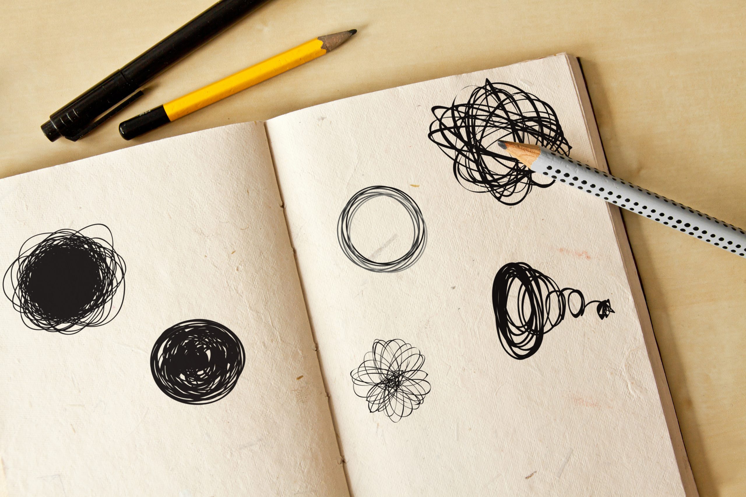
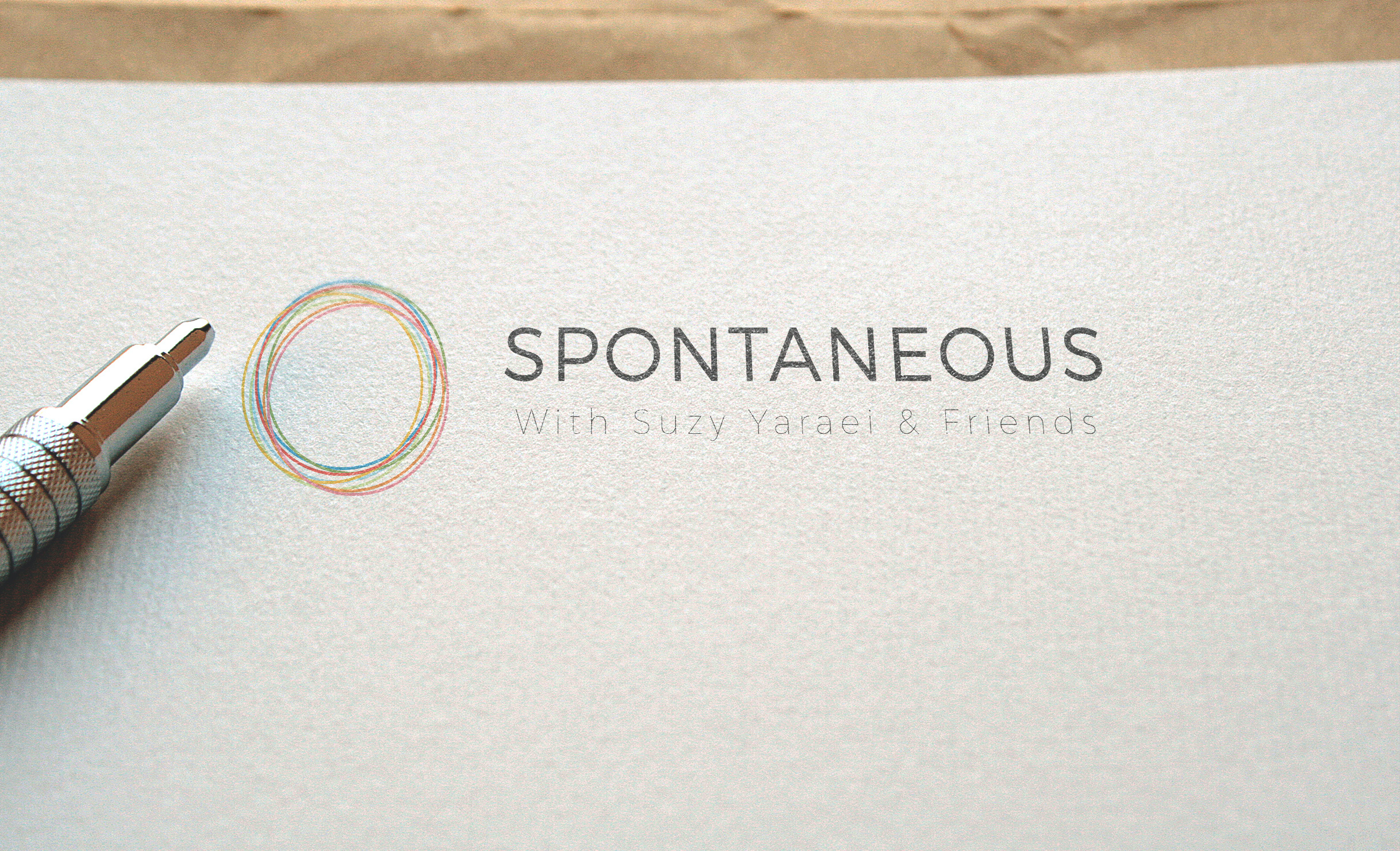
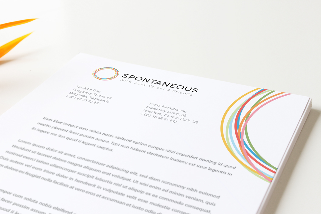
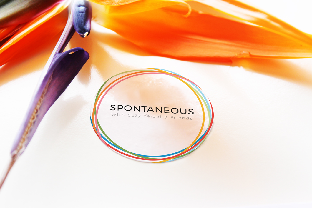
Putting the 'spontaneous' in the Logo itself
The circular logo, bursting with vibrant energy and life, was meticulously crafted using a palette of nine colors: grey, green, light green, blue, baby blue, light pink, red, light orange and orange. Each color was carefully selected to represent different facets of the studio’s mission, from growth and renewal (greens and blues) to energy and passion (red and orange), and a sense of calm and serenity (light pink and baby blue).
The circular shape symbolizes unity and continuity, mirroring the cyclical nature of personal transformation through exercise. The result is a dynamic, visually engaging emblem that conveys the studio’s commitment to holistic well-being, spontaneity, and the full spectrum of positive physical and emotional change.
Pantone® 2171 C
C60 M25 Y0 K13
#489FDF
Pantone® 2276 C
C12 M0 Y35 K35
#89A84F
Pantone® Warm Red C
C0 M72 Y75 K2
#F9423A
Pantone® 2975 C
C32 M8 Y0 K8
#99D6EA
Pantone® 2275 C
C10 M30 Y0 K15
#C3DC93
Pantone® 708 C
C0 M40 Y33 K3
#F890A5
Pantone® 7549 C
C0 M30 Y100 K0
#FFB500
Pantone® 715 C
C0 M40 Y78 K5
#F68D2E
Pantone® 425 C
C2 M0 Y0 K65
#54585A