Garda - Steak house
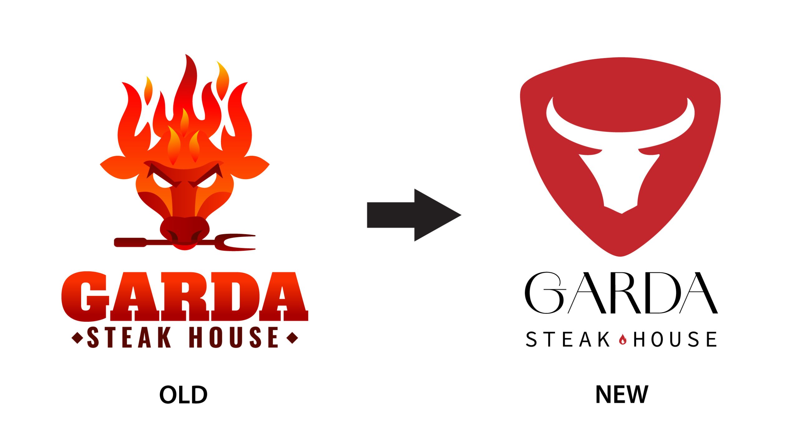
The reimagined logo for Garda Steak House embodies a fresh, sophisticated aesthetic that mirrors the restaurant's evolution from a traditional grill house to a refined dining experience.
The logo features a minimalist approach, focusing on clean lines and elegant typography to convey a sense of modernity and sophistication.
The centrepiece of the logo is a stylised representation of a cow head, subtly integrated into the typography or symbol to symbolise the restaurant's core offering of premium steaks. This symbol is designed with a minimalist touch, avoiding excessive details and opting for a sleek and timeless look.
The colour palette chosen for the logo reflects the restaurant's new identity, with muted tones such as deep maroon and dark charcoal gray, adding a touch of luxury and warmth. These colours also harmonise with the restaurant's updated interior, creating a cohesive brand experience for customers.
Overall, the rebranded logo for Garda Steak House strikes a balance between sophistication and simplicity, capturing the essence of a contemporary dining establishment while retaining the heritage and quality associated with premium steak offerings.
ClientGardaServicesRe-BrandingYear2021
