Glass House Winery
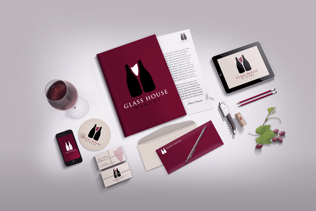
The visual identity created for Glass House Winery brings a fresh and striking look to their brand. By cleverly using negative space, the design conveys a wine glass and bottles, subtly hinting at the essence of the winery's products while adding a touch of modernity. This approach not only makes the logo visually intriguing but also reflects the innovative and contemporary nature of Glass House Winery's business.
Complementing this creative use of negative space is the choice of typography, employing the elegant and timeless Trajan Pro font. The typography adds a sense of sophistication and class to the overall design, aligning perfectly with the premium quality associated with fine wines. Together, the negative space design and elegant typography create a cohesive and memorable visual identity for Glass House Winery, capturing the essence of their business while making a bold statement in the competitive wine industry.
ClientGlassHouse WineryServicesLogo DesignYear2020


