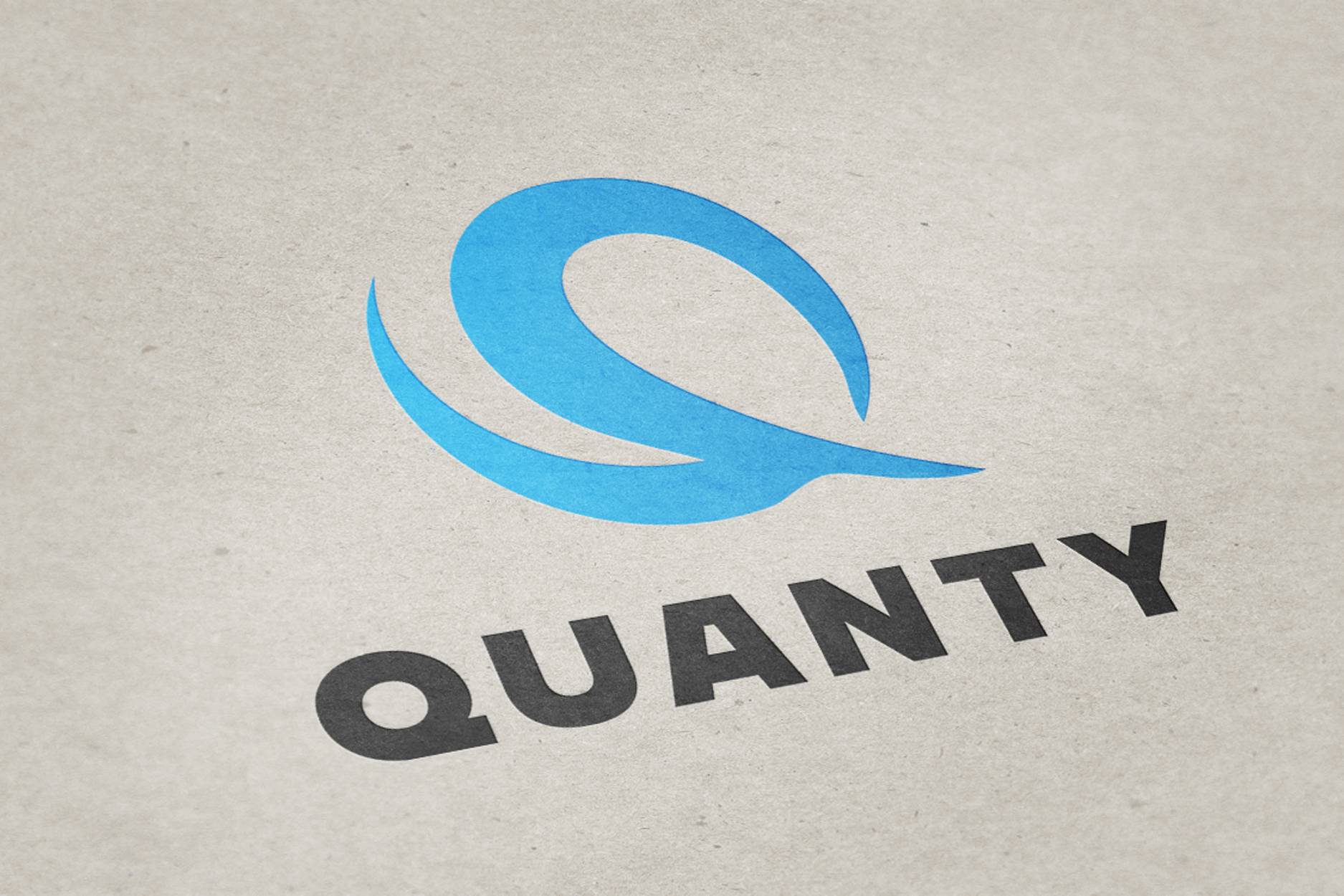
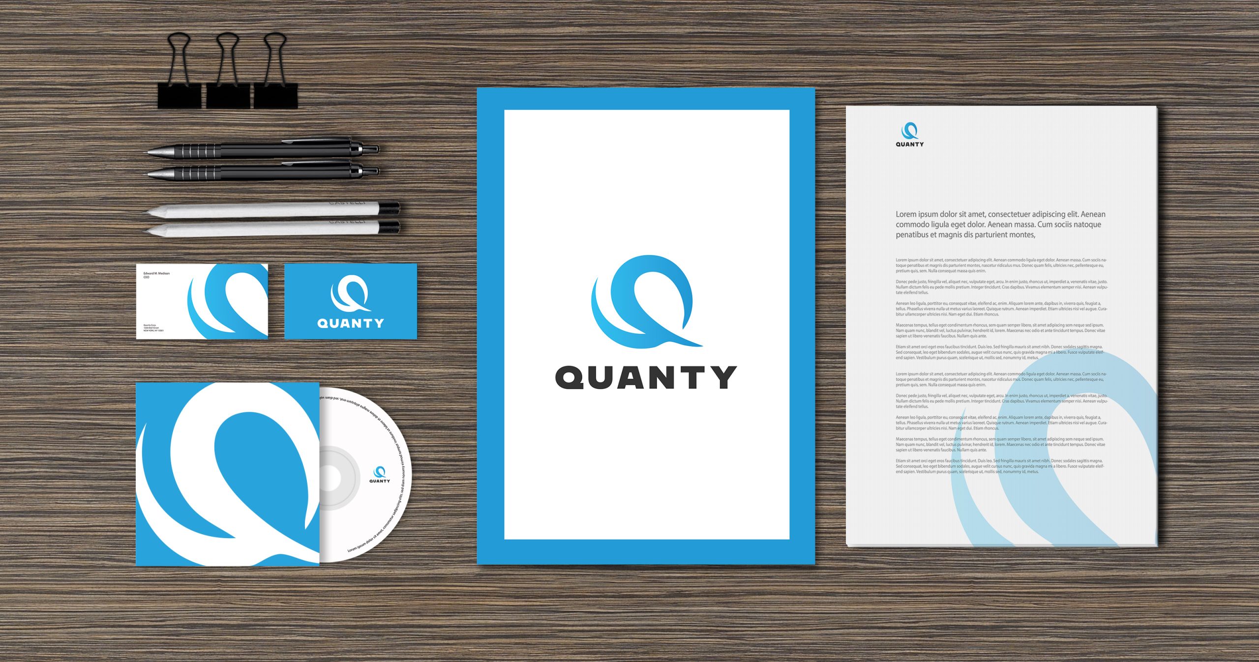
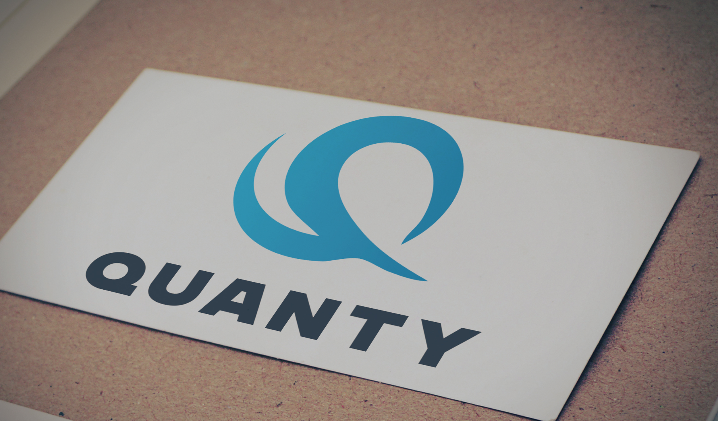
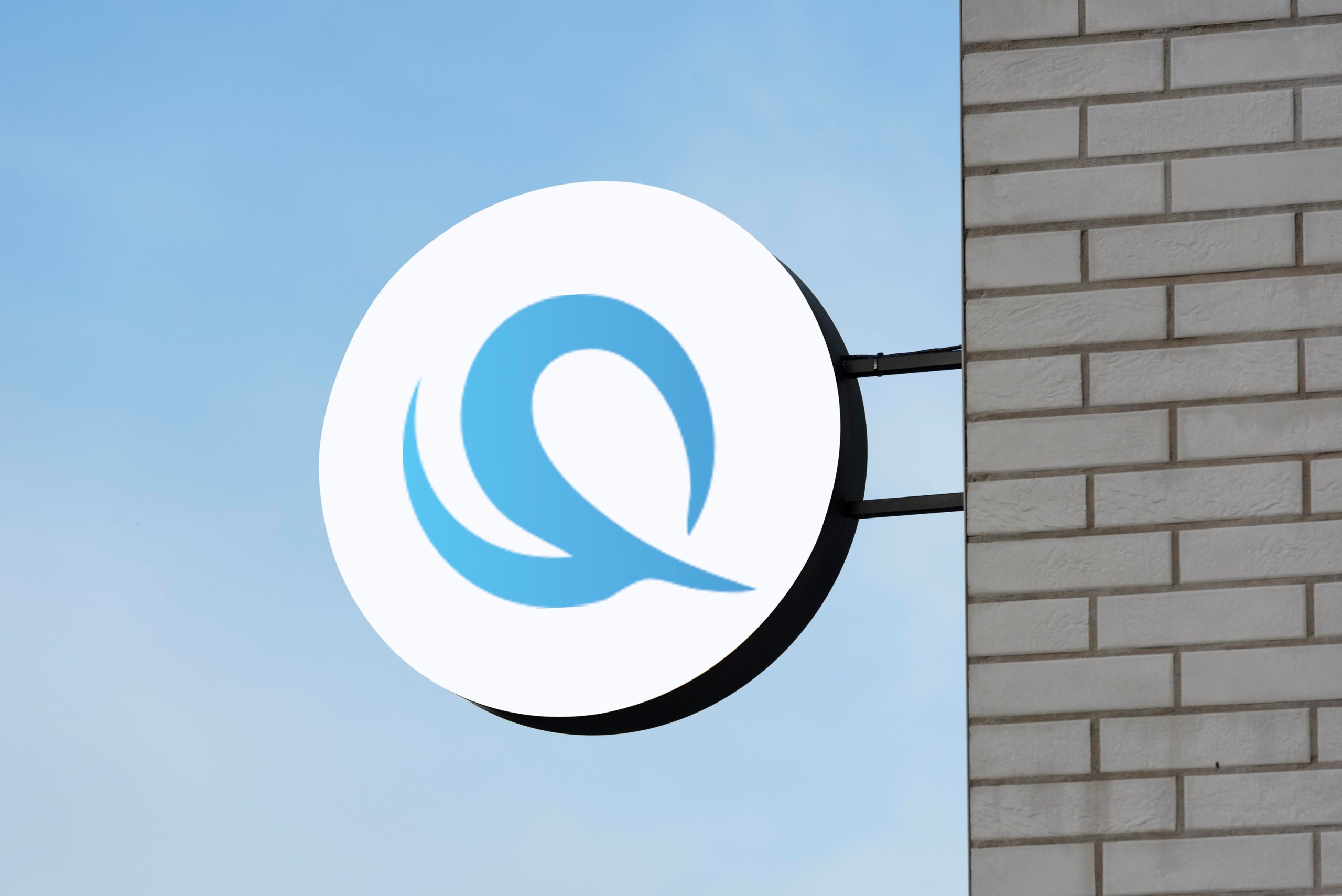
Quanty's logo embodies the essence of precision and expertise in quantitative research and consulting.
Client
Quanty Corp.
Year
2016
Services
Visual Identity

Visualising data
The central element of the design, the Q symbol, represents the company’s core focus on quantitative methodologies. Its sleek and modern design reflects Quanty’s innovative approach to data analysis and problem-solving. The Q symbol is surrounded by subtle elements that signify the diverse industries the company serves, such as finance, healthcare, and marketing, showcasing Quanty’s versatility and wide-ranging expertise
The color palette chosen for Quanty’s logo combines shades that convey trust, reliability, and sophistication. Deep blues evoke a sense of stability and intelligence, perfect for a company delving deep into data-driven insights. The typography used is clean and professional, complementing the Q symbol without overshadowing it. This combination creates a logo that is not only visually striking but also versatile, fitting seamlessly across various platforms and applications, from digital interfaces to print collateral, ensuring Quanty’s brand presence leaves a lasting impression