QuickPack
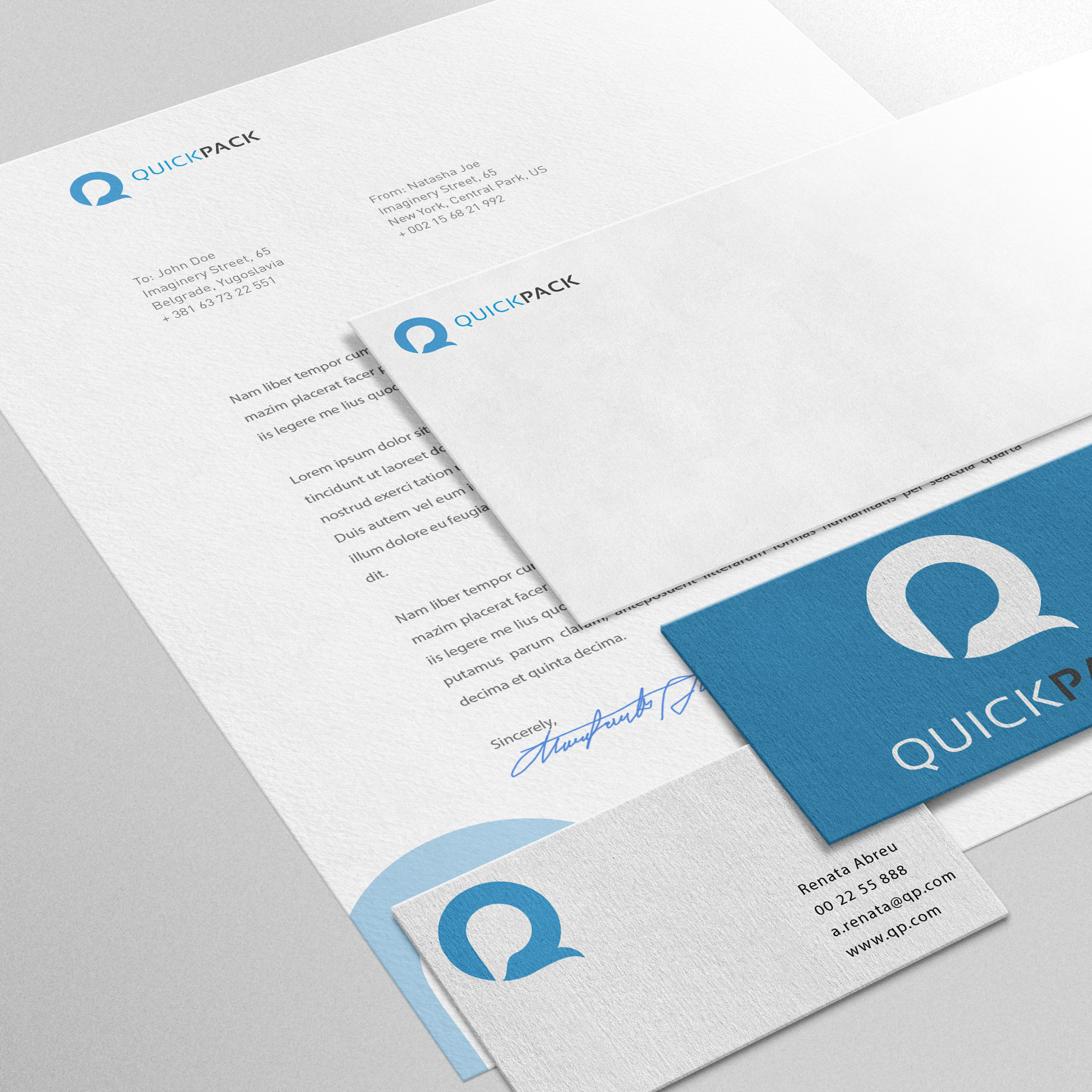
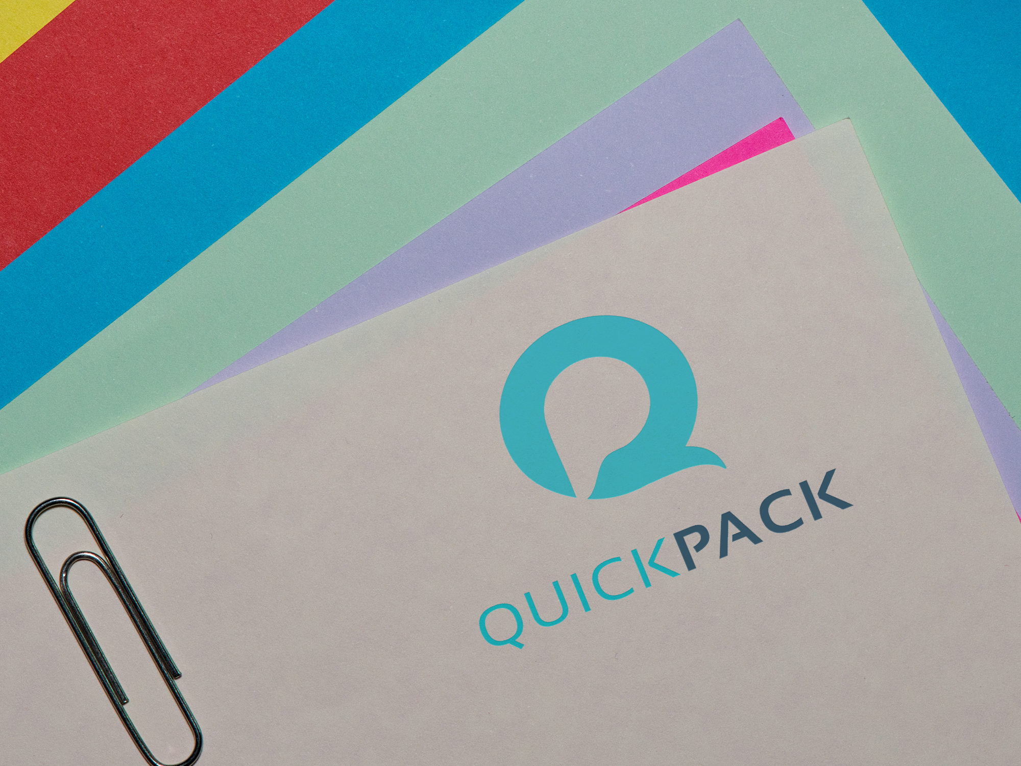
The logo design for QuickPack encapsulates the company's core philosophy of adaptability and versatility in custom packaging solutions. The logomark is designed to convey a sense of flexibility and responsiveness, mirroring QuickPack's commitment to meeting the unique needs of every client. Its dynamic and fluid lines symbolize the company's ability to tailor packaging solutions to fit seamlessly with diverse requirements, showcasing QuickPack as a reliable partner in delivering customized packaging solutions.
To further emphasize QuickPack's flexibility, the typography chosen for the logo is characterized by a modern and adaptable font style. This font choice underscores QuickPack's agile and responsive approach to their work, ensuring that the brand's visual identity aligns with its commitment to meeting client needs efficiently and effectively. Together, the logomark and typography create a cohesive brand image that communicates QuickPack's dedication to providing tailored and flexible packaging solutions for every client.
ClientQuickPackServicesLogo Design, BrandingYear2022
