In the vast landscape of branding and marketing, logos stand as the iconic symbols representing businesses, organisations, and even ideology. Behind every memorable logo lies a careful orchestration of shapes and colours, each chosen with precision to convey a specific message or evoke particular emotions. In this comprehensive exploration, we delve deep into the intricate world of logo design, unraveling the psychology behind shapes and colours, and uncovering the secrets to crafting logos that leave a lasting impression.
Understanding the Fundamentals: Shapes in Logo Design
Shapes serve as the building blocks of logo design, each carrying its own set of meanings and connotations. From the sturdy stability of squares to the dynamic energy of triangles, every shape communicates a distinct message to the audience.
Various client Logomarks
Squares and Rectangles: The Pillars of Stability
At the core of many logos lie squares and rectangles, representing order, stability, and reliability. These four-sided structures evoke feelings of trust and security, making them ideal for brands seeking to establish a sense of solidity and dependability. Whether it’s the robustness of a bank’s logo or the steadfastness of a tech company’s emblem, squares and rectangles instil a sense of confidence in consumers, assuring them of the brand’s credibility.
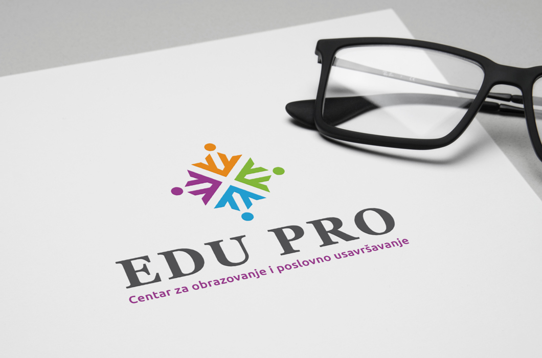
Logo made for EDUPRO – an educational provisioning company
However, the rigid lines of squares and rectangles also come with limitations. While they excel in projecting a sense of stability, they may struggle to capture attention or convey creativity. Tilted slightly, these shapes can inject a hint of dynamism into the design, but at the risk of compromising their inherent qualities of order and formality.
Triangles: The Symbol of Strength and Direction
In contrast to the steadfastness of squares, triangles exude a sense of energy and ambition. With their sharp angles and pointed tips, triangles convey notions of progress, growth, and forward momentum. Brands looking to make a bold statement or assert their leadership often turn to triangles to imbue their logos with a sense of purpose and dynamism.

Logo Design for VIGILANTE – urban apparel company.
The orientation of a triangle can further influence its symbolism. When placed upright, triangles represent stability and balance, while inverted triangles suggest tension and instability. By strategically incorporating triangles into their logos, businesses can signal their commitment to innovation and advancement, positioning themselves as pioneers in their respective industries.
Circles: The Emblem of Unity and Continuity
As the embodiment of completeness and unity, circles hold a special place in logo design. With no beginning or end, circles symbolise harmony, wholeness, and eternal cycles. From the iconic rings of the Olympic Games to the timeless allure of global brands like Nike, circles evoke a sense of inclusivity and timelessness, inviting consumers to become part of something greater than themselves.
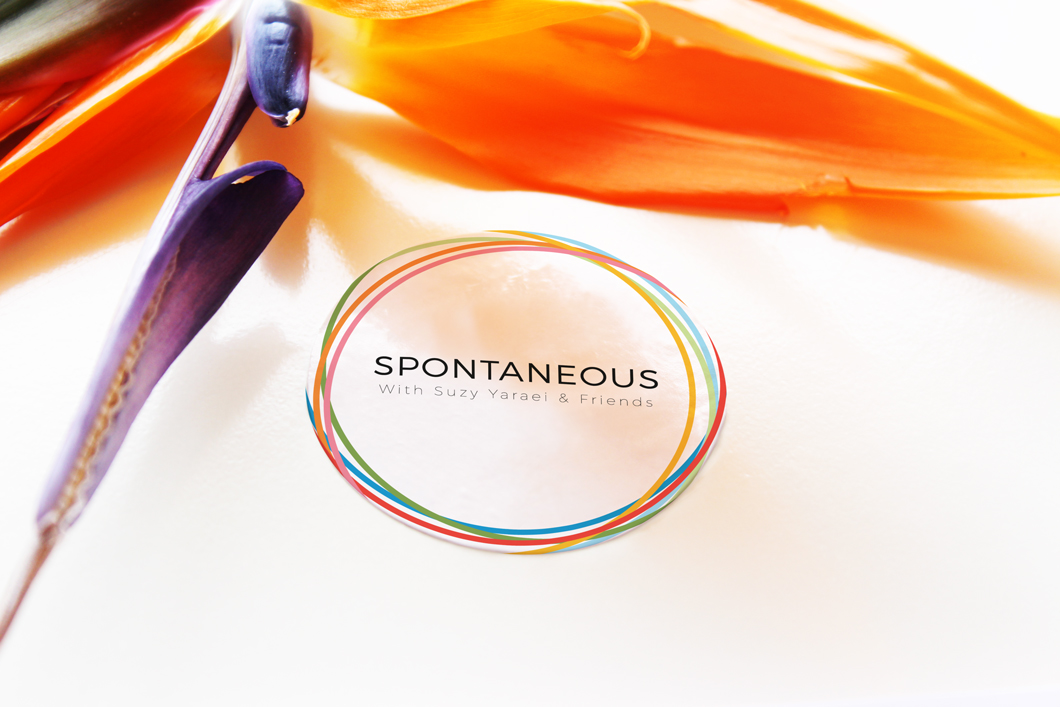
Logo Design for SPONTANEOUS – a body reformative and exercise studio.
Beyond their visual appeal, circles also carry profound psychological implications. Their rounded edges and symmetrical contours evoke feelings of warmth, comfort, and approachability, making them particularly well-suited for brands seeking to foster trust and connection with their audience. Whether used as standalone elements or integrated into more complex designs, circles infuse logos with a sense of unity and continuity, anchoring them in the collective consciousness of consumers.
The Intricacies of Colour: Harnessing Emotional Resonance in Logo Design
While shapes provide the foundation for logo design, it is colour that breathes life and emotion into these visual compositions. From the calming allure of blues to the fiery passion of reds, each colour carries its own psychological weight, shaping the viewer’s perception and eliciting specific emotional responses.
Blue: The Epitome of Professionalism and Trustworthiness
Widely regarded as the colour of professionalism and trustworthiness, blue reigns supreme in the corporate world. From the iconic logos of tech giants like IBM to the soothing hues of financial institutions like Chase, blue conveys a sense of reliability, competence, and authority. Its calming effect on the mind instills a sense of confidence in consumers, assuring them of the brand’s competence and integrity.

Logo design for BLUE MOON – animal hospital.
Red: The Beacon of Passion and Energy
At the opposite end of the spectrum lies red, a colour synonymous with passion, energy, and excitement. Whether it’s the bold lettering of Coca-Cola or the vibrant swoosh of Coca-Cola, red commands attention and ignites the senses, making it a popular choice for brands looking to make a bold statement. Its association with vitality and dynamism lends logos a sense of urgency and vitality, compelling consumers to take notice and take action.
Yellow: The Radiant Glow of Optimism and Cheerfulness
As the colour of sunshine and happiness, yellow radiates warmth, optimism, and cheerfulness. Brands seeking to convey a sense of positivity and friendliness often turn to yellow to infuse their logos with a sense of joy and optimism. Whether it’s the golden arches of McDonald’s or the playful lettering of Post-it, yellow captures the imagination and uplifts the spirit, leaving a lasting impression on consumers.
Green: The Symbol of Growth and Renewal
Symbolising growth, renewal, and vitality, green holds a special place in logo design. From the eco-conscious ethos of Starbucks to the lush imagery of Whole Foods, green conveys a sense of harmony with nature and a commitment to sustainability. Its association with health and wellness resonates with consumers, fostering a sense of trust and loyalty towards the brand.

The Art of Integration: Blending Shapes and Colours for Maximum Impact
While shapes and colours each carry their own significance in logo design, it is their harmonious integration that truly elevates a logo from mere symbol to iconic emblem. By strategically combining shapes and colours, designers can create logos that resonate deeply with consumers, forging emotional connections and fostering brand loyalty.
For example, a logo featuring a circle in soothing blue hues conveys a sense of trust and stability, while a triangle in vibrant red evokes a feeling of energy and excitement. By carefully balancing these elements, designers can craft logos that capture the essence of the brand and resonate with its target audience on a visceral level.
Forging Emotional Bonds
Effective Logo design transcends mere aesthetics; it delves into emotions, establishing connections with audiences. Utilising shape psychology empowers designers to:
Stir Intended Emotions: Through deliberate shape selection, designers can guide viewers’ emotions as desired. For instance, a charity brochure might employ circles to evoke empathy and compassion.
Augment Storytelling: Shapes can reinforce narratives. For instance, a travel company might opt for a circular design to symbolise the notion of a journey and discovery.
Capture Attention: Certain shapes naturally attract the eye. Unconventional or unexpected shapes can add allure and compel viewers to delve deeper.
Shape psychology in graphic design offers a captivating exploration of how geometry elicits emotional and cognitive responses. By leveraging the potency of shapes, designers can craft visuals that resonate deeply, effectively conveying messages and forging connections. As you embark on your design journey, acknowledge the influence of shapes and let them collaborate in communicating impactful narratives, emotions, and concepts.

Logo Design for BALANCED IMPACT – a mental health organiSation.
Conclusion: Crafting Meaningful Logos Through Shape and Colour Psychology
In conclusion, the psychology of shapes and colours plays a crucial role in logo design, allowing brands to communicate their values and personality effectively. By understanding the meanings behind different shapes and colours and combining them thoughtfully, designers can create logos that make a lasting impression and resonate with consumers on an emotional level. So, the next time you’re designing a logo for your brand, remember to consider the psychology behind shapes and colours to create a design that truly speaks to your audience.
Ready to actualise your vision? Whether you seek an enthralling logo, attention-grabbing marketing materials, or a breathtaking website design, I’m poised to translate your concepts into compelling visuals that leave an enduring impression. Get in touch – I’d love to hear what you’re thinking and how I can help.

Related Posts

Case Study: Cherish Visual Identity
Step-by-step walkthrough of the Visual identity crafting for Cherish Visual…
Case Study: CyberSecurity Summit Visual Identity
Step-by-step walkthrough of the Visual identity crafting for CyberSecurity…
Free DIY Logos and Why They’re Bad for Business
The allure of taking the DIY route may seem like a cost-effective and rapid…