Your logo is the face of your brand. It’s the visual representation of everything your business stands for. A well-designed logo can make a significant impact on your brand’s identity and recognition. Whether you’re launching a startup or looking to refresh your existing brand, the process of creating a logo is a critical step. In this comprehensive guide, I will explore how I go about designing a logo in detail.
1. Define the Brand Identity
The foundation of any logo design project is a deep understanding of the clients brand identity. To design a logo that accurately represents their business, they must have a clear grasp of who they are and what they and their business stand for. Therefore I start by asking the client essential questions:
– Is there a unique story to your business and name?
– What values does your business embody?
– What makes your business unique and different from competitors?
– Who is your ideal target audience (age, gender, likes, dislikes)?
– What is the big vision for your brand?
These questions will serve as a compass throughout the rest of the design process. The logo should encapsulate the brand’s personality and convey a message consistent with their core values.
‘‘I always have two clients in any project.I'm responsible to the people who pay me to design and the people who have to live with my designs.’’
-Liz Ogbu
2. Research the Industry and Competitors
Logo design doesn’t exist in a vacuum; it’s influenced by industry trends and the logos of the client’s competitors. The main focus of research goes into studying the logos of businesses within the respective industry. Looking for common design elements, colour palettes, and visual styles I pay attention to what works and what doesn’t.
However, while industry research is valuable, it’s equally important to find their brand’s own unique voice. The logo should stand out and represent the clients business’s individuality. The main consideration being – what sets their business apart and how the logo can reflect that distinctiveness.
The outcome of this effort results in ‘Mood boards’ that reflect the collected data in a visual form, that helps drive the ‘Creative direction’ for the design itself.
Example: “Spontaneous” Logo design process
''Your ability to seamlessly blend creativity with strategic thinking sets you apart, and the seamless communication throughout the process made the collaboration an absolute pleasure. The result is a logo that not only meets but exceeds our expectations, leaving a lasting impression on both our team and our customers. Thank you''
— Suzy Yaraei, CEO 'SPONTANEOUS'
3. Determine Strategy and Creative direction
Transforming the research and insights into actionable ideas is a vital aspect of strategic thinking. So I invest time into crafting a positioning statement and conducting scenario analysis to articulate the strategy behind the solutions, that can guide the client towards both short-term and long-term success.
Selecting appropriate channels should be based on the behaviours and preferences of the target audience, aligned with the client’s marketing objectives.
The identity, tone, and values of a brand play a crucial role in its recognisability. Also I take into account the stages of the purchase funnel or customer journey to effectively engage your target audience. This way I ensure that their positioning statement incorporates a distinct point of difference, tangible end benefit, and credible reason to believe, all substantiated by research rather than personal opinion.
Since the logo will likely be used across a variety of mediums, from digital platforms like websites and social media to physical materials such as business cards, signage, and merchandise, each of these applications may require slightly different versions of the logo to ensure it looks its best.
I put quite a bit of consideration into where and how the logo will be used. Versatility is key, so I need to ensure the logo remains recognisable and appealing across all applications by creating different versions and variations.
4. Sketch and Brainstorm Ideas
Finally at this point in the process I begin brainstorming and sketching. With just a pen and paper, and I let my creativity flow. I try to generate as many ideas as possible, no matter how rough or imperfect they may be. This is the ideation phase, where I explore different concepts, symbols, fonts, and layouts.
These initial sketches should serve as a visual brainstorm, as I experiment with various elements to see what resonates with your brand’s identity. It’s a stage where I allow ideas to run wild without worrying about perfection. This is my playground for creativity, where I am most myself.
5. Move to Digital Design
After exploring ideas through sketches, it’s time to transition to digital design, in order to create a polished version of the logo.
Working digitally offers several advantages:
– Precision: I can create clean, precise lines and shapes.
– Scalability: Vector graphics, done in Adobe Illustrator, can be scaled up or down without loss of quality, making your logo versatile.
– Edit-ability: Digital files are easy to edit and adapt, which is crucial for refining your design later on in the process.

6. Seek Feedback
Designing a logo is not a solitary process. It’s essential to gather feedback from the client. Constructive criticism can provide valuable insights and help you make informed design decisions.
Feedback can include opinions on colour choices, font selection, and overall composition. I am open to suggestions, but also remember – the client needs to stay true to their brand’s identity and values. The goal is to refine the logo, not completely transform it into something else.
7. Refine and Iterate
Based on the feedback I’ve received, it’s time to refine the logo design. Paying attention to details, as small adjustments can make a significant difference. Ensuring that every aspect of your logo serves a purpose and aligns with your brand’s identity.
Sometimes, the refinement process involves simplification. A minimalist and clean logo can often be more memorable than a cluttered one. I always work towards removing any unnecessary elements and focus on what truly represents your brand.
“It is not the daily increase, but the daily decrease. The height of cultivation always runs to simplicity...”
— Bruce Lee
8. Choosing the Right Colours and Fonts
Colour and typography are powerful tools in logo design. They evoke emotions and create associations. Choose colours that resonate with your brand’s personality is the crucial piece of communication your brand’s values to the customer.. For example, blue might convey trust and professionalism, while red could represent energy and passion.
Similarly, the fonts select should align with your brand’s character. A playful, hand-drawn font might work well for a children’s brand, while a sleek, sans-serif font could be perfect for a tech company.
Example: ”Duende” Logo colour palette

9. Considering Versatility
The logo should look great in all contexts and across various platforms. It should be equally effective when displayed on a tiny mobile screen or on a large billboard. Consider how your logo will adapt to different sizes and mediums.
Create variations of your logo for different use cases. A simplified version might be suitable for small applications, while a more detailed version can be used for larger formats. This versatility ensures that your logo maintains its impact in various scenarios.
10. Finalising the design
Once I’m satisfied with the logo design, it’s time to finalise it and save it in various file formats for future use. Most importantly all the before mentioned conclusions and key points are transferred to a Brand guideline book, intended as a comprehensive document that serves as a reference for anyone involved in creating, promoting, or representing the brand to ensure a consistent and cohesive brand identity across various touch-points and interactions.
The client doesn’t simply receive a Logo design at the end of this process. Rather they are enabled to further develop their Brand based on the goal we achieve as a result of the process:
- Brand depth and story
- Brand recognition
- Credibility and trust
- A place in the market
- Memorability
- Community building
- Target marketing
In conclusion, designing a logo for a client is a creative and strategic journey. The logo is more than just a visual mark; it’s the embodiment of your brand’s identity. That is precisely why I take the time to plan, research, and refine the design to create a logo that effectively communicates your brand’s personality and sets you apart from the competition.
It’s essential to remember that logo design is not a one-time effort, but an ongoing process. As your business evolves, your logo may need updates in the future, to remain relevant and appealing to your audience. A well-designed logo is an investment that can yield substantial returns in brand recognition and customer trust.

Related Posts
May 4, 2025
Case Study: Cherish Visual Identity
Step-by-step walkthrough of the Visual identity crafting for Cherish Visual…
April 28, 2024
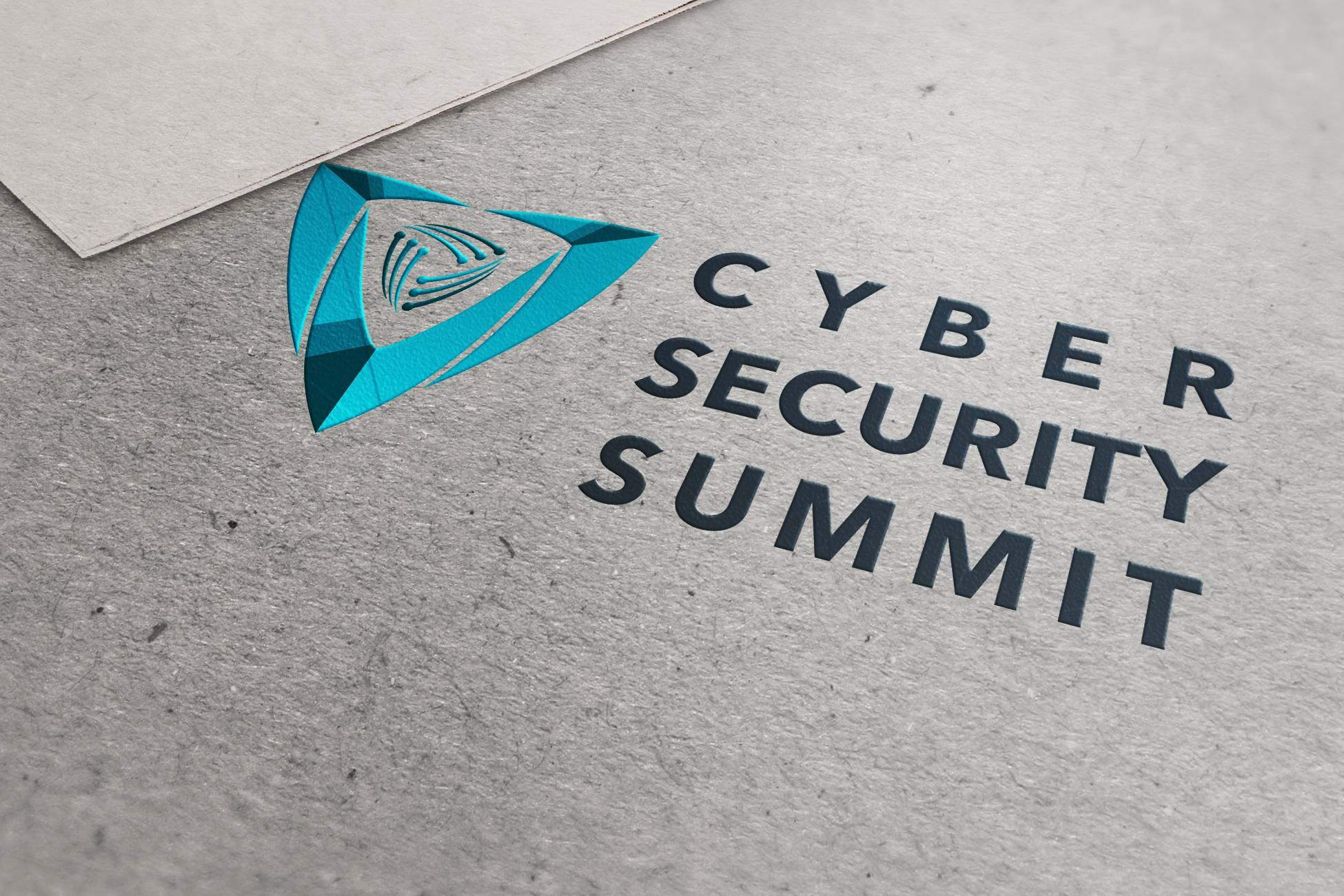
Case Study: CyberSecurity Summit Visual Identity
Step-by-step walkthrough of the Visual identity crafting for CyberSecurity…
March 25, 2024
Free DIY Logos and Why They’re Bad for Business
The allure of taking the DIY route may seem like a cost-effective and rapid…


