Branding project for a Senior's home 'Cherish' , based in Belgrade, which aims to provide a unique approach to care and create a people-focused community.
Client
Cherish
Year
2025
Services
Branding
Website
cherish.company
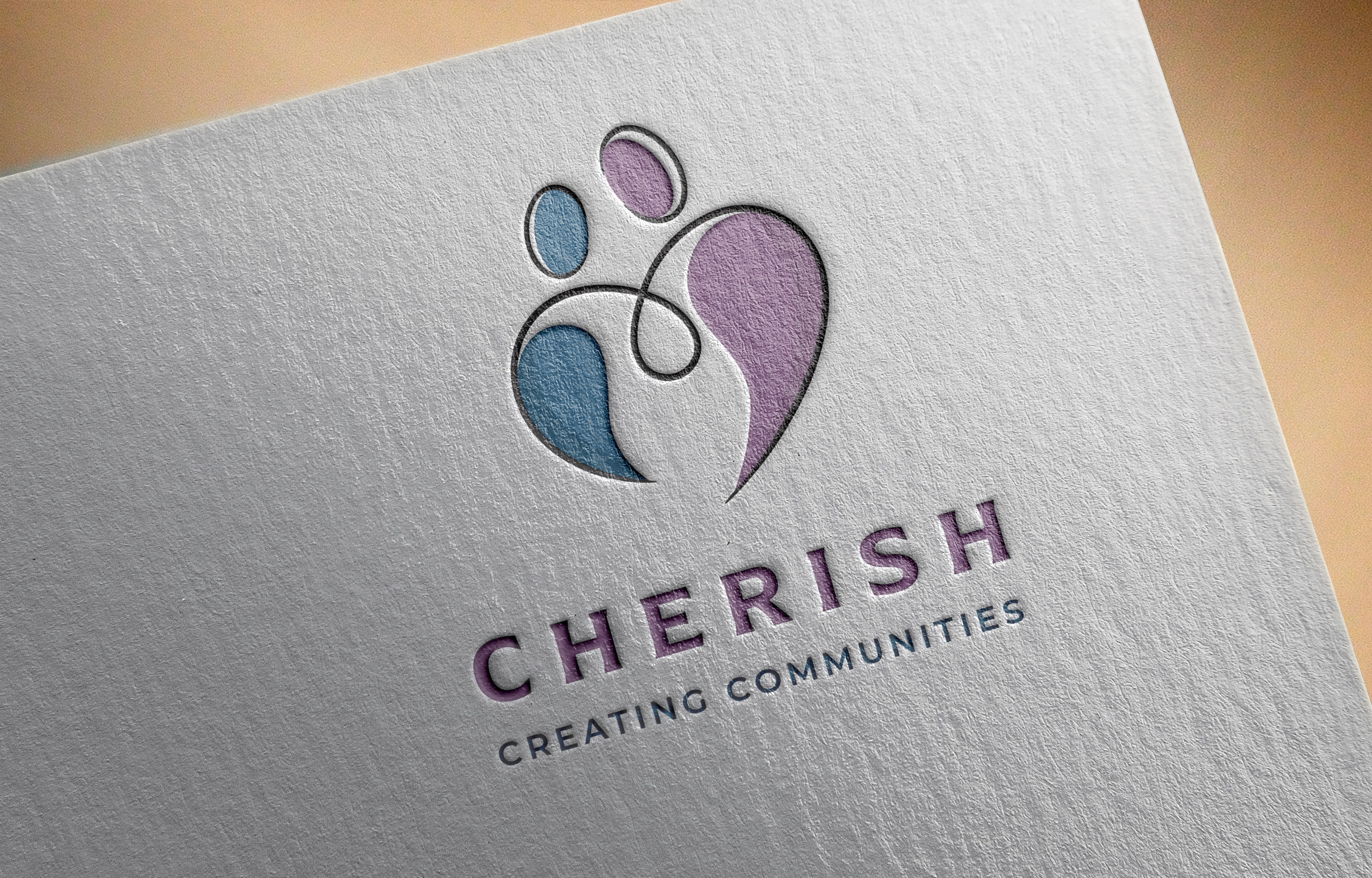


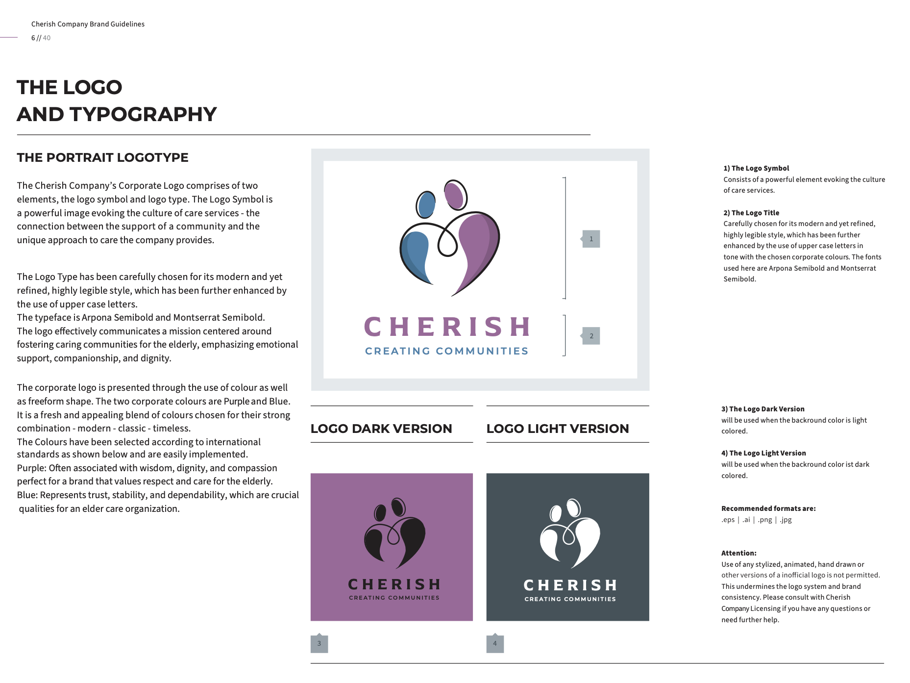
'Care' as an image
Cherish company approached me with a distinctive mission – to create a complete Visual identity that encapsulates their vision:
Respect for the individual, maintaining and protecting their dignity and quality of life.
Cherish’s Opportunity:
- Establish itself as a leader in personalised, premium care.
- Highlight the emotional connection and a people-focused community.
Damir from the offset demonstrated a highly professional approach combined with a natural creative flair. He enquired about our vision for the company and after actively listening to our ideas guided us with his calm, patient and engaging style through the process of creating our visual identity. What started out as a simple need for a logo developed into a journey of discovery about our brand.
The whole experience of working with Damir on our visual identity was both rewarding and enjoyable. We are looking forward to continuing our partnership with him has we further develop our brand.
I have no hesitation in recommending Damir to anyone seeking to develop a visual identity that truly reflects their brand.
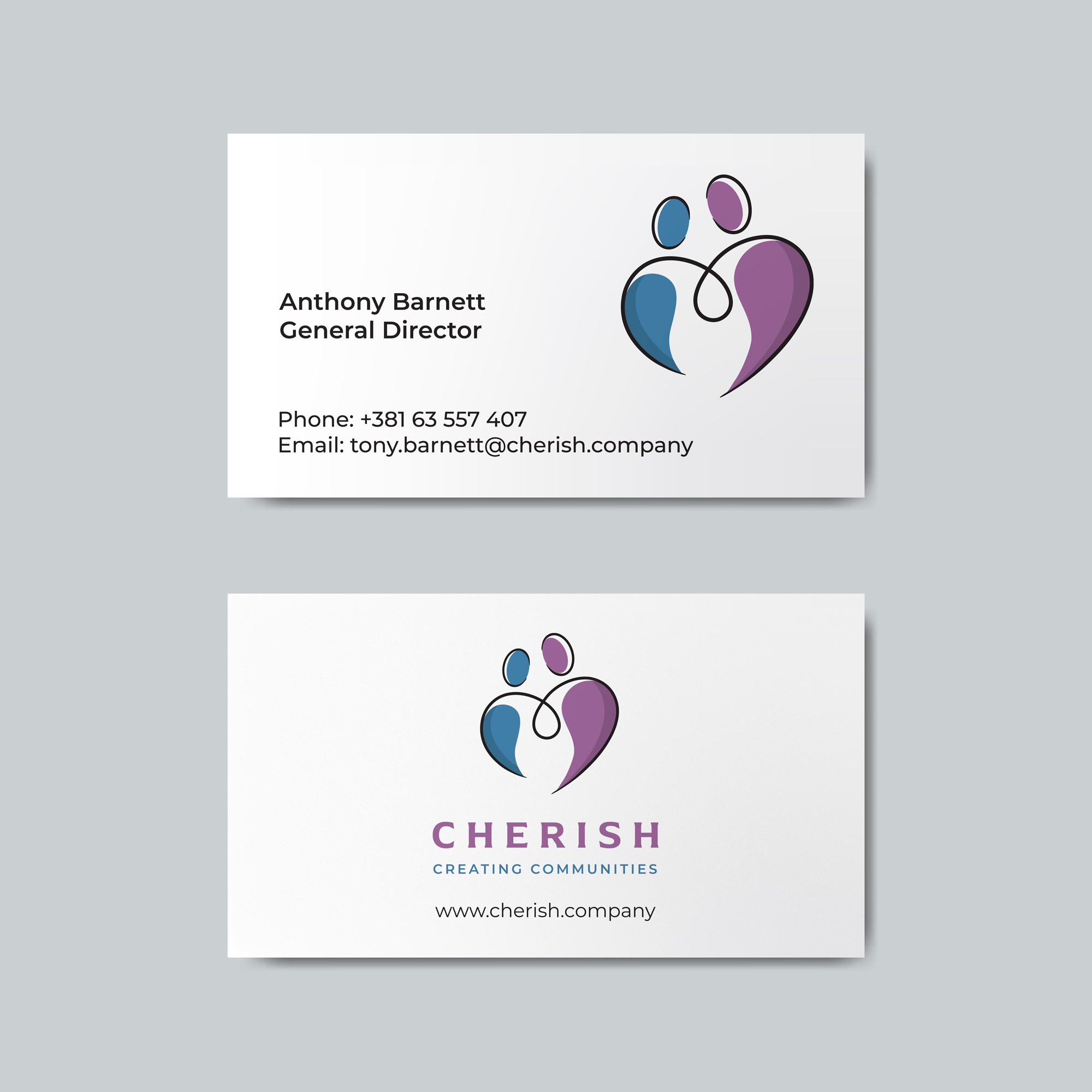
Tony Barnett
General Director
Pantone® 7440C
C100 M70 Y10 K0
#9F689B
Pantone® 7656C
C50 M75 Y25 K5
#875883
Pantone® 646C
C75 M40 Y15 K0
#4281AC
Pantone® 653C
C80 M50 Y25 K5
#366F92
⸺ Research
In the research phase, I focused on the vision of Cherish build around the unwavering belief that every individual deserves dignity, respect, and an exceptional quality of life.
⸺ Strategy
Armed with insights from the research phase, I embarked on defining the creative direction for the logo. People-Oriented Visuals - This direction relied on images rich in smiles, interactions, and real moments of care, illustrating Cherish as a place built for and by people.
⸺ Conceptualisation
I explored various concepts and visual elements that could represent these values effectively. The tagline "Creating communities" became a pivotal element, guiding the design choices.
This phase laid the foundation for the visual identity- a softer, more inviting
aesthetic that would highlight the emotional bonds and deep trust.
⸺ Symbol
I decided to try and breakdown the symbol itself as a symbol of care, compassion, unity and human connection.
⸺ Typography
Choosing a clean, modern font like Montserrat for the text ensured readability and a contemporary feel. Alternatively, the tagline "Creating communities" offered a longer yet impactful version for certain applications.
⸺ Colours
Deep variations of purple and green were employed to evoke a sense of unity, care and empathy. Dark grey for the frame portion of the logo reinforces the strength of the whole image. These colours are commonly associated with deep feelings of care and trust.