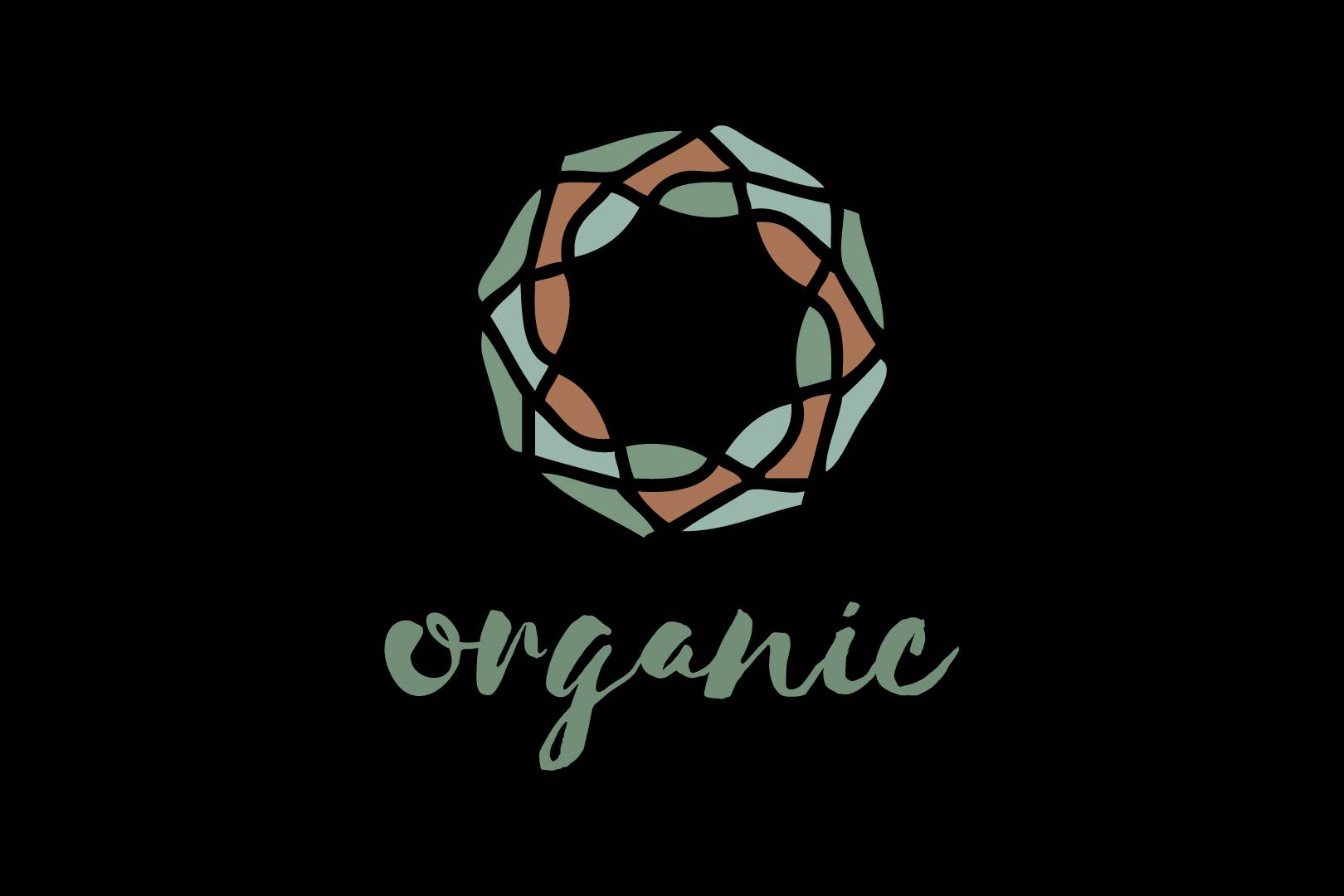
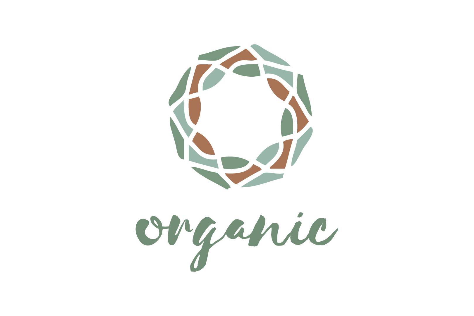
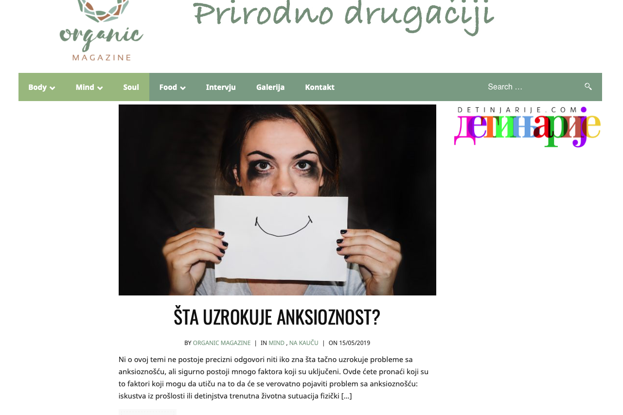
New brand identity for Organic Magazine: online magazine for food and health.
Year
2018
Services
Logo Design
Web Design
Client
Organic Magazine
Branding stealth equity. In 2018, an old friend of mine reached out to me with an exciting proposition: to embark on a creative journey together for her upcoming online magazine, which she aptly named ‘Organic Magazine.’ As we delved into the depths of her vision, discussing how she aimed to convey a unique message to her audience and how the ever-evolving market landscape would shape her content.I was immediately captivated by the idea of crafting a visual identity that would encapsulate the very essence of unbridled vitality and encompassing energy. Picture this: a symbol that would not merely suggest, but exude an irresistible, all-encompassing flow of life force. This symbol would serve as the magazine’s visual anchor, a magnetic beacon drawing readers into the vibrant world of ‘Organic Magazine’.
Together, we worked hard to develop a unique brand. The entire branding process was quite creative, and the result was harmonious from every point of view.
Moreover, to complement this emblematic icon, I envisioned a handcrafted, freeform name for the brand. This personal touch, born from the fluid strokes of a talented artisan, would not only mirror the dynamic energy of the content but also evoke a sense of authenticity and approachability.So, in the heart of our creative collaboration, ‘Organic Magazine’ was poised to transcend the ordinary and become a radiant fusion of symbolism and artistry, capturing the very essence of life’s inexhaustible flow in its visual identity and branding. It was a project destined to breathe fresh life into the online magazine world, a vibrant testament to the power of creativity and imagination.
Pantone® 2406 C
C11 M0 Y9 K38
#819E87
Pantone® 623 C
C12 M0 Y5 K27
#9AB9AD
Pantone® 4645 C
C0 M20 Y33 K32
#AD7C59
Communicating through colour
The colour choices I made for ‘Organic Magazine’ were carefully curated to evoke a deep connection with the natural world and reflect the essence of vitality and authenticity that the brand aimed to convey.
The primary color, green, serves as the cornerstone of our palette. It’s not just any green; it’s a rich, earthy shade that resonates with the lushness of forests and the vibrancy of life. This choice of green speaks to the magazine’s commitment to all things natural, from eco-friendly practices to embracing the beauty of the environment.
Complementing this earthy green, we introduced a light brown hue. This warm, inviting color symbolizes the grounding and nurturing qualities found in nature. It’s akin to the comforting embrace of tree bark or the gentle caress of sun-drenched soil. The light brown provides a sense of stability and reassurance to our brand, reminding readers of the magazine’s commitment to authenticity and holistic well-being.
Finally, the addition of a light green shade adds a touch of freshness and vitality to the mix. It’s reminiscent of new growth and budding life, echoing the ever-evolving and forward-thinking nature of ‘Organic Magazine.’ This lighter green accentuates the dynamism and energy that courses through the brand’s content..
Collectively, these carefully chosen colors – rich green, warm brown, and invigorating light green – form a harmonious palette that encapsulates the magazine’s core values. They transport the audience to the heart of nature’s beauty, inviting them to explore and connect with the diverse content within ‘Organic Magazine,’ where every hue tells a story of growth, authenticity, and the boundless energy of the natural world.